Off-white is never just white. It represents a highly complex spectrum of desaturated pigments reacting dynamically to available light. Applying a stark, untinted white to a residential wall creates a harsh, clinical environment. Paint manufacturers introduce microscopic amounts of yellow, gray, green, or pink pigment to raw white base to create off-white formulas. This chemical adjustment alters the entire physical presence of the room. A successful interior relies on matching the specific undertone of the wall paint to the structural materials operating within the floor plan. Mastering off-white colour combinations requires analyzing light reflectance, physical texture, and color temperature.
1. Warm Alabaster And Charcoal Grey
Charcoal gray anchors warm alabaster off-white.. Source: Interior Company
Designers frequently apply this combination to manipulate spatial perception. Painting the primary drywall alabaster reflects ambient light across the room. Applying charcoal grey to heavy millwork, interior doors, or a central fireplace surround draws the human eye directly to those structural features. The dark pigment absorbs light, creating a sharp, crisp boundary against the soft walls. This pairing works perfectly in formal living rooms lacking massive amounts of natural sunlight. The high contrast provides visual interest without relying on aggressive, saturated colors.
2. Cool Ivory And Rift-Sawn Walnut
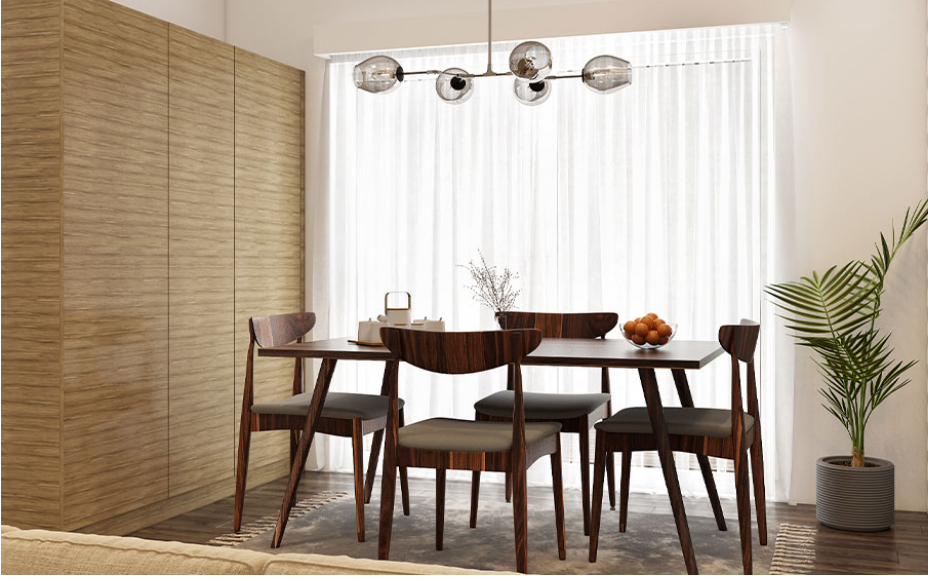
Wood introduces organic friction into any built environment. Flat drywall requires tactile materials to break up the visual monotony. Pairing a cool, gray-leaning ivory with rift-sawn walnut creates a sophisticated mid-century aesthetic. The cool undertones in the ivory paint recede from the eye, pushing the walls outward. The room feels expansive and calm.
Walnut wood carries deep chocolate and subtle purple pigments. The straight, linear grain of rift-sawn walnut adds vertical geometry to the room. Using this timber for custom cabinetry, floating shelves, or a massive dining table grounds the cool ivory walls. The physical texture of the raw wood interrupts the smooth finish of the paint. The eye registers the natural imperfection of the timber against the manufactured perfection of the drywall. Those executing permanent millwork upgrades rely on experts in custom home building to guarantee the carpentry matches the exact temperature of the selected paint. The woodwork becomes a seamless extension of the architecture.
3. Cream And Unlacquered Brass
Hardware dictates the physical temperature of an interior. Silver and polished chrome read as cold and commercial. They disappear against light walls. Pairing a rich, yellow-based cream with unlacquered brass introduces massive historic weight into modern construction.
The cream paint provides a soft, enveloping background. Unlacquered brass provides an active, living finish. The raw metal reacts to the oils in human hands and ambient humidity. It develops a dark, uneven patina over decades of use. The golden hue of the brass pops aggressively against the soft cream walls. Designers specify this exact combination for high-end kitchens and primary bathrooms. Solid brass faucets, heavy cabinet pulls, and wall-mounted sconces act as industrial jewelry for the room. The friction between the aging metal and the pristine cream paint creates a deeply authentic atmosphere.
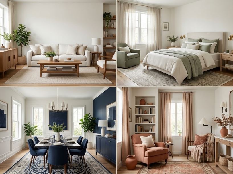
4. Bone White And Sage Green
Rooms meant for physical recovery require a specific biological response. The human nervous system reacts instantly to certain wavelengths of light. Pairing bone white with desaturated sage green triggers the parasympathetic nervous system, lowering the heart rate and slowing respiration.
Bone white contains a mixture of gray and brown undertones, creating a flat, earthy baseline. Sage green mimics the natural colors found in a forest canopy. The brain registers this environmental data as a signal for rest. Applying bone white to the ceiling and upper walls keeps the room feeling tall and airy. Installing sage green wainscoting or heavy green velvet drapery anchors the lower half of the room. This exact split provides extreme visual relief, making it the standard choice for primary bedrooms and private reading lounges.
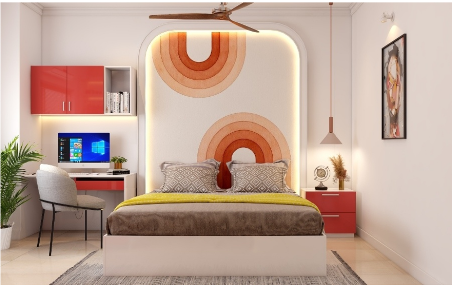
5. Chalk White And Baked Terracotta
Geographic orientation alters how paint reads throughout the day. South-facing rooms receive intense, warm sunlight. Applying chalk white—a highly desaturated, matte finish—absorbs this direct glare. The matte surface scatters the light, preventing harsh optical reflections. Pairing this dry white with baked terracotta introduces heavy earthly friction.
Terracotta tiles or deep rust-colored textiles provide a direct complementary contrast on the color wheel. The physical tension between the flat white walls and the warm, orange-red terracotta keeps the human eye actively engaged. This combination mimics arid, desert landscapes. Installing authentic, unglazed terracotta floor tiles introduces immense tactile texture. The rough surface of the baked clay provides slip resistance and thermal mass, holding ambient heat during cool evenings.
6. Pearl White And Navy Blue
Traditional architecture relies heavily on nautical and academic color pairings. Navy blue carries profound historic gravity. It absorbs light aggressively, creating deep, impenetrable shadows. Pairing navy blue with pearl white delivers a crisp, highly engineered aesthetic.
Pearl white contains faint iridescent or blue undertones. These cool tones harmonize perfectly with the heavy navy pigment. Designers use this pairing to fix structural imbalances. A long, narrow corridor often resembles a tunnel. Painting the far end wall navy blue pulls that surface visually forward. This color application squares off the proportions of the hallway. Applying pearl white to the adjacent walls keeps the corridor from feeling too dark. This high-contrast strategy works beautifully in formal dining rooms, home libraries, and structured entry foyers.
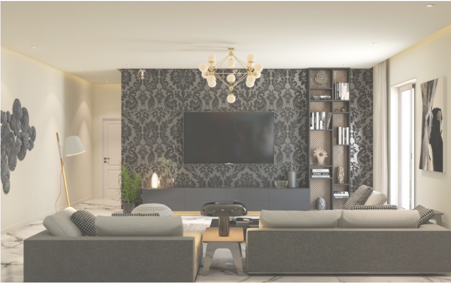
7. Soft Greige And Blackened Steel
Modern industrial design requires extreme material discipline. Flat black paint often looks cheap and synthetic. Blackened steel provides a raw, textured alternative. The chemical blackening process leaves the metal with a mottled, deep gray-black finish. Pairing this industrial metal with soft greige creates a balanced, highly sophisticated environment.
Greige mixes gray and beige pigments. It provides the warmth of a traditional tan with the crisp modernity of a cool gray. Applying greige to the walls offers a calm, unobtrusive background. Blackened steel architectural elements—such as custom stair railings, massive window frames, or floating fireplace hearths—slice through the soft paint. The sharp, metallic lines define the geometry of the room. The greige paint prevents the steel from feeling overly cold or hostile.
8. Layered Tone-On-Tone Ivory
The most difficult color combination involves no contrasting colors at all. Creating a monolithic, tone-on-tone environment requires manipulating sheen and physical texture rather than shifting pigments. A room built entirely around different shades of ivory demands strict architectural control.
The strategy involves painting the walls in a flat ivory finish. The trim and interior doors receive a high-gloss lacquer in the exact same color formula. The color remains identical. The sheen dictates the physical boundary. The flat walls absorb light. The glossy trim bounces light aggressively across the room. Adding ivory boucle textiles, heavy linen drapery, and bleached oak floors creates distinct layers of physical friction. The eye registers a continuous volume of space rather than a series of disconnected geometric blocks.
| Off-White Undertone | Optimal Material Pairing | Primary Architectural Application |
|---|---|---|
| Yellow / Warm | Charcoal Grey, Brass | Formal living rooms, high-contrast kitchens |
| Gray / Cool | Rift-Sawn Walnut, Navy | Mid-century interiors, formal libraries |
| Green / Earthy | Sage Green, Terracotta | Primary bedrooms, recovery zones |
| Neutral / Greige | Blackened Steel, Oak | Industrial lofts, modern open floor plans |
Analyzing Light Reflectance Value
Paint selection requires mathematical verification. The Light Reflectance Value (LRV) dictates exactly how much visible light a painted surface bounces back into a room. The scale runs from zero to one hundred. Pure black registers near zero. Pure white registers near one hundred.
Off-white formulas typically score between seventy and eighty-five on the LRV scale. A room featuring limited natural daylight demands a high-LRV paint to prevent the space from feeling like a dark cavern. Applying a low-LRV shade to a small, windowless powder room creates a moody, intimate jewel-box effect. The physical dimensions and the window placement of the room dictate the required LRV threshold.
Testing paint swatches directly on the drywall is a mandatory step. Natural daylight changes temperature constantly. A soft off-white looks fresh and crisp at sunrise. That exact same paint appears flat and muddy by sunset. Standard LED bulbs emitting light above 4000 Kelvin cast a harsh, bluish glare, destroying complex paint undertones. Sourcing bulbs between 2700 and 3000 Kelvin casts a warm, amber glow, adding rich depth to the painted walls. Observing the selected paint swatch under both natural and artificial light guarantees the final color combination performs exactly as intended.