Aged kitchen colors are becoming a serious alternative to the all-white or cool-gray kitchen, especially for homeowners who want warmth without chasing a short-lived look. Research on 2026 kitchen design points to oxblood red, aubergine, deep navy, brown, and terracotta as aged, moody choices that can make a kitchen feel more grounded and lived-in, as reported by Homes & Gardens. The appeal is easy to understand, but the practical question is harder: will a darker, warmer palette still work with your light, flooring, counters, and daily maintenance habits?
Why Aged Kitchen Colors Are Gaining Ground
Aged Kitchen Colors In A Real Kitchen
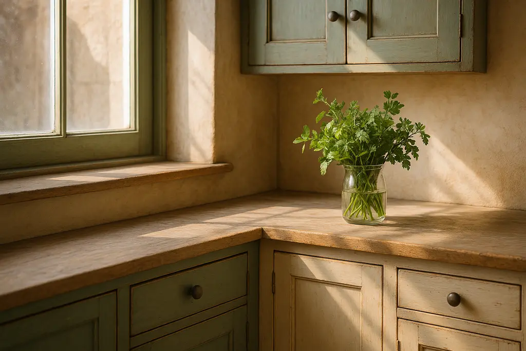
The strongest aged palettes usually avoid a flat, newly painted look. Oxblood, aubergine, deep navy, brown, and terracotta all carry a sense of age because they sit closer to earth, wine, ink, clay, and wood than to bright primary color. That does not mean every kitchen should become dark. It means color can be used with restraint: a bank of lower cabinets, a pantry wall, an island, or a painted hutch may be enough to shift the room away from sterile white without making the work space feel heavy.
A useful planning case is the common kitchen with white upper cabinets, pale counters, and a wood floor. In that setting, an aubergine or deep navy island can add depth while leaving the main preparation areas visually open. If the kitchen already has dark flooring and limited daylight, the same color on every cabinet face may feel closed in. The case-study lesson is simple: the color itself is only one variable. The room’s size, daylight, ceiling height, backsplash, and reflective surfaces decide whether a moody choice reads as calm or cramped.
Where Dark Color Can Go Wrong
That is where aged kitchen colors need a cautious approach. Dark cabinet fronts can show dust, fingerprints, water marks, and chips differently than pale finishes. A dramatic sample may look convincing online, then appear almost black in a north-facing kitchen or muddy beside a cool gray countertop. Homeowners should review large painted samples in the actual kitchen, in morning and evening light, before approving a cabinet order or refinishing quote.
It is also worth separating design confidence from resale certainty. A warmer, moodier kitchen may make a home feel more personal, but no cabinet color can promise a higher resale outcome. For homeowners who may sell soon, a lower-risk approach is to keep permanent surfaces quieter and place deeper color on elements that can be repainted more easily. For broader color planning beyond kitchens, this site’s article on pastel and muted color palettes offers a related way to think about undertones and softer room-to-room transitions.
Choose Moody Hues With Light And Material Checks
Balance Saturation With Texture
Deep, saturated colors such as navy, charcoal, espresso brown, and forest green are also being discussed as 2026 cabinet directions, with the strongest results relying on balanced lighting and texture, according to Decor Kingdoms. That balance matters because kitchens are not showrooms. They need bright task lighting for cutting, cooking, washing, and cleanup, while also feeling comfortable during breakfast or evening use.
Texture can prevent darker color from looking flat. Wood grain, stone movement, handmade-looking tile, brushed metal hardware, and woven seating can soften a deep palette. A deep navy cabinet with a cool white counter may feel crisp, while the same cabinet beside warm stone and oak may feel more aged. Neither is automatically better. The safer choice depends on what already exists in the room and what the homeowner is willing to maintain.
Test Cabinet Color Before Ordering
Paint chips are too small for this decision. A larger sample door or painted board should be viewed vertically, because cabinet color is seen on upright planes rather than lying flat on a table. Place the sample near the countertop, flooring, backsplash, and any adjacent wall color. If possible, view it under the bulbs you plan to use after the project. Bulb temperature can shift how red, green, purple, or brown undertones appear.
For those interested in design inspiration, Weekend Villas provides an excellent resource to see how deeper hues can harmonize with natural materials in inviting spaces. Still, reference images should never replace in-room testing. Photography, screen brightness, editing, and staged lighting can all make color appear cleaner or brighter than it will look at home.
Project Planning, Budget Priorities, And Safety Boundaries

Paint, Refinish, Or Replace Cabinets
The decision to paint, refinish, reface, or replace cabinets should come before choosing the final color. If cabinet boxes are solid and the layout works, refinishing may be enough. If drawers stick, hinges are failing, storage is poor, or water damage is present, color alone will not solve those functional problems. A homeowner can compare design ideas, but structural cabinet repairs, major layout changes, and new electrical or plumbing work should be handled by qualified professionals.
Painted cabinet projects also need realistic expectations. Factory finishes and site-applied finishes do not always age the same way. A darker color may make touch-ups more visible if the sheen or batch is slightly different. Before signing a contract, ask what preparation, primer, finish system, curing time, and warranty language the painter or cabinet shop uses. Those questions are practical risk control, not decoration.
Hardware, Ventilation, And Work Zones
Hardware can either calm a moody palette or sharpen it. Brushed brass, bronze, black, and nickel each create a different reading against aubergine, navy, or espresso brown. Large pulls may stand out strongly on dark slab doors, while smaller knobs may recede. The right answer depends on cabinet style, hand comfort, cleaning habits, and how much contrast the room can carry.
- Keep task lighting bright enough at counters, sink areas, and cooking zones.
- Confirm that darker finishes still work with the existing floor and countertop undertones.
- Use samples on vertical surfaces before approving a final cabinet color.
- Hire licensed trades for electrical, plumbing, ventilation, or structural changes.
- Leave room in the budget for hardware, touch-up materials, and professional surface preparation.
Ventilation and lighting should not be treated as afterthoughts. If a kitchen already has weak hood performance, poor lighting, or unsafe wiring, a color update should not distract from those issues. Homeowners should avoid DIY electrical or ventilation changes unless they are qualified and local rules allow the work. Good design supports safe cooking and cleanup first; mood comes after the room functions properly.
Aged Kitchen Colors That Stay Livable
Keep The Palette Flexible
The strongest use of aged kitchen colors is usually measured rather than theatrical. A deep island, a brown pantry wall, terracotta lower cabinets, or an aubergine hutch can create character while leaving future flexibility. If the household prefers a quieter room, the same mood can come from smaller areas of color, warmer wall paint, or stained wood rather than a full cabinet repaint.
For homeowners tracking broader design direction, the shift toward warmer, more character-led interiors also connects with modern interior design ideas for 2026. The kitchen should still be planned around daily routines: who cooks, how much natural light the room receives, how often the surfaces are cleaned, and whether the budget supports proper preparation.
Moody kitchen color works best when it is treated as a long-term material decision, not a weekend impulse. Start with the fixed elements, test the color in place, respect safety boundaries, and choose the level of depth your home can support. That approach gives aged color the best chance to feel settled, useful, and timeless rather than forced.