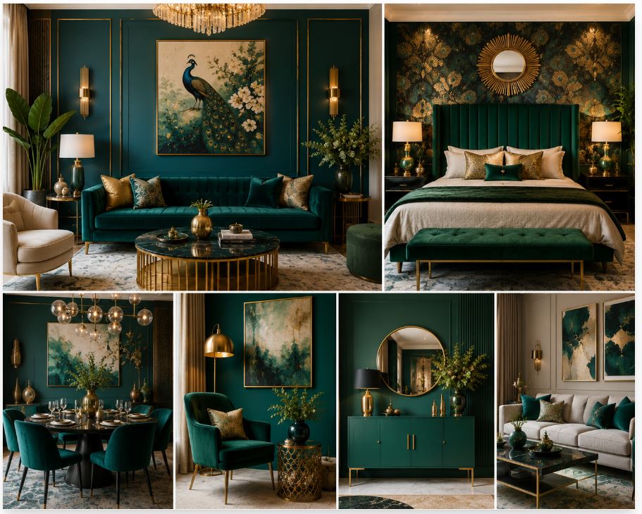
Residential architecture spent years trapped in a cycle of sterile gray and flat white boxes. Homeowners and designers now reject that visual silence. Deep, saturated jewel tones command the modern interior landscape. Peacock green sits at the exact intersection of rich emerald and dark cyan. It carries immense visual density and historic weight. Applying this bold pigment transforms a basic room into a highly engineered, atmospheric sanctuary. Executing flawless peacock green colour combinations requires moving past simple paint swatches. A successful installation demands a strict understanding of light reflectance, material friction, and spatial geometry.
The Science Of Saturated Jewel Tones
Paint manufacturers measure how much visible light a color bounces back into a room using the Light Reflectance Value (LRV) scale. Pure white registers near one hundred, reflecting almost all light. True black registers at zero. Peacock green scores exceptionally low on this scale. It absorbs natural and artificial light aggressively. This absorption creates deep shadows and physical depth on flat drywall.
Applying a low-LRV color requires exact lighting strategies to prevent the room from feeling oppressive. The fundamental principles of color theory dictate that dark, cool-toned greens recede visually. This optical illusion tricks the human eye. The dark walls seem to push backward, which can make small, confined spaces feel much deeper and more expansive than they actually are. The brain stops processing the exact boundaries of the room and focuses on the rich, enveloping atmosphere.
High-Contrast Pairing: Peacock Green And Warm Whites
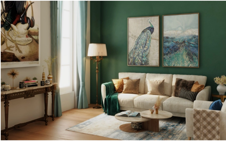
Monochromatic dark rooms require severe design discipline. Most residential floor plans benefit heavily from high-contrast pairings. Placing peacock green next to a stark, hospital white creates immediate visual shock. The transition feels aggressive and cheap. Pairing the deep green with warm, creamy whites offers a superior geometric balance.
Applying an alabaster or soft ivory finish to the ceiling and the upper third of the walls reflects ambient light back down into the room. This bright upper envelope keeps the heavy, dark green sections grounded near the floor. The visual weight remains anchored. The warm undertones in the creamy white prevent the green from looking too cold or clinical during the morning hours when natural sunlight leans blue.
Metallic Friction: Unlacquered Brass And Deep Green
Hardware, plumbing fixtures, and lighting enclosures dictate the physical temperature of a room. Silver and polished chrome often disappear against cold, dark colors. Peacock green demands a warm metallic counterpoint to create necessary friction. Unlacquered brass provides massive organic value in this specific application.
The golden tones of the brass stand out sharply against the dark cyan background. The living finish of unlacquered brass develops a dark, uneven patina over time. The metal reacts to the oils in human hands and the ambient humidity in the air. The friction between the aging, imperfect metal and the crisp, saturated paint adds a layer of historical authenticity to modern construction. Cast bronze and burnished copper offer similar warming effects, providing heavy, industrial anchors against the smooth painted walls.
| Material Pairing | Visual Impact | Recommended Application |
| Unlacquered Brass | High contrast, warm, historic | Cabinet hardware, wall sconces |
| Rift-Sawn Walnut | Organic, grounding, textured | Furniture, exposed ceiling beams |
| Terracotta Textiles | Complementary friction, bold | Upholstery, heavy drapery |
| Honed Carrara Marble | Crisp, elegant, light-reflecting | Fireplace surrounds, countertops |
Organic Warmth: Walnut Wood And Earth Pigments
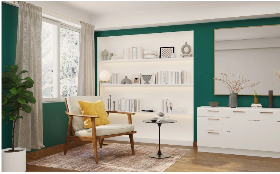
Solid color blocks need physical texture to avoid looking flat and synthetic. Natural timber introduces chaotic, organic grain patterns into the visual field. Rift-sawn walnut acts as the perfect companion for peacock green colour combinations. The deep chocolate and subtle purple undertones of the walnut wood mesh seamlessly with the cool blue-green paint. A solid walnut dining table or floating wooden shelves interrupt the monolithic painted walls, giving the eye a natural resting place.
Introducing secondary earth pigments completes the palette. Terracotta, burnt orange, or deep rust fabrics provide a direct complementary contrast on the color wheel. The tension between cool green walls and a warm rust velvet sofa keeps the human eye actively engaged. This specific combination mimics the natural color balance found in deep forest landscapes, triggering a subconscious biological comfort.
Monolithic Application And Custom Millwork
Basic drywall limits the architectural impact of bold colors. Creating structural depth requires custom millwork. Applying peacock green across floor-to-ceiling wainscoting, library bookcases, and heavy crown molding changes the physical sensation of the room.
A technique known as color drenching involves painting the baseboards, walls, window casings, and trim the exact same shade. Erasing the contrasting trim lines blurs the physical boundaries of the room. The corners recede entirely into shadow. The eye registers a continuous volume of space rather than a series of disconnected geometric shapes. Homeowners pursuing flawless architectural integration rely on experts in custom home building to guarantee the carpentry matches the bold intent of the paint selection. The millwork becomes a seamless, permanent extension of the architecture. Spraying the paint rather than rolling it provides a factory-grade finish on carved wooden details, ensuring the dark color looks rich and perfectly smooth.

The Role Of Natural Light And Solar Orientation
The geographic orientation of a room alters how peacock green reads throughout the day. The color shifts dynamically based on the angle and the temperature of the sun.
North-facing rooms receive indirect, cool, bluish light. This light amplifies the blue undertones in peacock green, pushing the color closer to a moody teal or navy. Designers often counter this cooling effect by heavily increasing the warm brass and wood tones in the room. South-facing rooms receive intense, warm, golden sunlight. This direct exposure brings out the rich emerald and yellow undertones of the paint, making the walls look vibrant and highly energized.
East and west-facing rooms experience extreme color shifts. An east-facing room looks bright and fresh in the morning, gradually turning darker and more subdued by late afternoon. Understanding this solar geometry prevents costly painting mistakes. A color that looks perfectly balanced in a bright southern exposure will look like a completely different paint formula in a shadowed northern corridor.
Textiles And Acoustic Dampening In Saturated Rooms
Dark rooms create an expectation of quiet intimacy. Hardwood floors and flat drywall bounce sound waves relentlessly, destroying that atmospheric promise. The resulting echo makes the space feel vast and unsettling. High-density textiles solve this structural problem. They absorb stray sound waves and provide massive amounts of physical comfort.
Drapery operates as a primary acoustic baffle. Installing wall-to-wall, floor-to-ceiling drapery in a matching dark green shade creates a soft, sound-absorbing boundary. Heavy wool or thick linen panels trap high-frequency noises, deadening the acoustics of the room.
Velvet serves as the ultimate fabric for deep jewel tones. The physical pile of the fabric absorbs light entirely differently than flat cotton or smooth leather. Upholstering a sofa or a headboard in peacock green velvet creates micro-shadows across the furniture. The fabric looks incredibly rich and invites immediate physical contact. Layering these heavy textiles against the hard, painted millwork grounds the room and finalizes the luxury aesthetic.
Engineering Artificial Illumination
Artificial lighting makes or breaks a saturated interior. Standard commercial LED bulbs cast a flat, bluish glare that flattens complex paint formulas. The dark walls will look cheap and artificial.
Sourcing bulbs with a high Color Rendering Index (CRI) guarantees the peacock green looks vibrant and accurate after dark. The color temperature must lean warm. Bulbs measuring 2700 Kelvin emit a soft, amber glow. This specific light flatters human skin tones and adds rich depth to the painted walls.
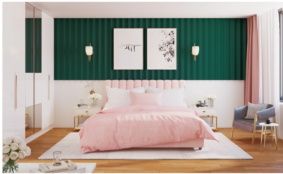
Lighting must operate on multiple independent circuits. Recessed ceiling fixtures provide general ambient light. Wall-mounted sconces cast directional beams across the textured plaster or painted woodwork. Dedicated reading lamps offer focused, high-intensity illumination exactly where required. Placing every single fixture on a dedicated dimmer switch grants the occupant total control over the atmospheric density of the space. The room transforms from a bright, functional workspace during the day into a deeply shadowed, sophisticated lounge at night.
Embracing peacock green requires confidence and architectural discipline. When executed with the correct material pairings and precise lighting, this bold pigment delivers an environment built for extreme longevity and uncompromising luxury.