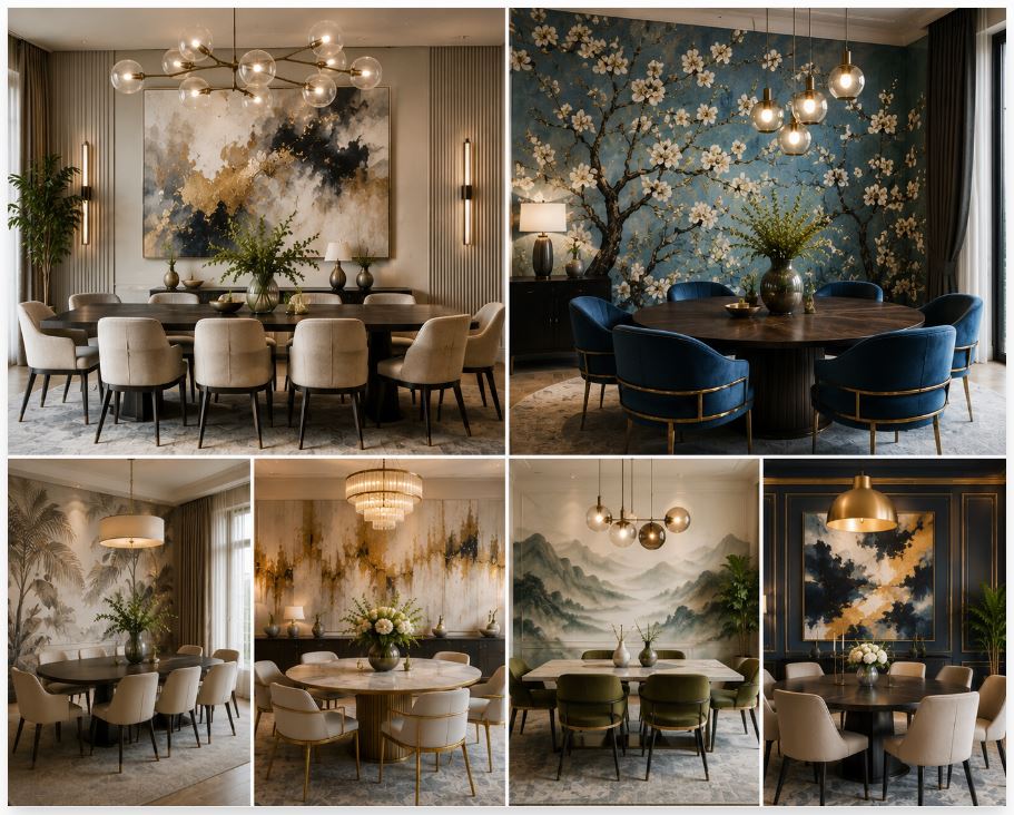
The dining room functions as the focal point for human connection within a residential floor plan. The walls act as the primary architectural boundary, defining the atmosphere of every gathering. Applying a new layer of paint provides the most immediate and profound structural transformation available. Executing a sophisticated dining room wall painting project requires moving beyond basic color selection. A flawless finish relies entirely on understanding color chemistry, spatial geometry, and the physics of light reflectance.
The Psychology Of Dining Room Colors
Color selection directly impacts human biology. The optic nerve processes specific wavelengths of light, triggering subconscious physiological responses. Warm tones—including deep terracottas, muted ochres, and rich burgundies—actively stimulate the appetite and encourage guests to linger around the table. These pigments absorb shadows and create an enveloping, protective atmosphere suited for long evening meals.

Cool tones demand careful calibration. A stark, icy blue suppresses appetite and leaves a formal dining space feeling clinical and cold. Selecting a cool palette requires opting for complex, gray-based greens or moody, desaturated navy blues. These darker tones provide a sophisticated, grounded backdrop for formal entertaining without dropping the perceived temperature of the room. The chosen hue dictates the entire emotional resonance of the dining experience.
Analyzing Light Reflectance Values
Every paint formula carries a Light Reflectance Value (LRV) rating scaled from zero to one hundred. This exact metric dictates how much visible light the painted surface bounces back into the room. A pure white reflects maximum light, registering near one hundred. A true black absorbs all light, registering at zero. Dining rooms frequently benefit from mid-to-low LRV colors. These shades absorb harsh glare and create a softer, more intimate environment.
The physical sheen of the paint alters this reflection completely. The industry categorizes finishes based on their angular sheen.
| Finish Type | Light Reflectance | Best Dining Room Application |
| Flat / Matte | Absorbs light heavily | Ceilings, low-traffic feature walls |
| Eggshell | Slight angular sheen | Primary vertical drywall surfaces |
| Satin | Noticeable bounce | Baseboards, doors, architectural trim |
| High-Gloss | Mirror-like reflection | Accent ceilings, custom millwork |
Applying a flat finish hides minor drywall imperfections and provides a rich, velvet texture. High-gloss lacquers act like colored mirrors. Painting a dining room ceiling with a high-gloss finish bounces candlelight across the room, doubling the perceived vertical height of the space.
Lighting Geometry And Color Perception
The appearance of a painted wall shifts dramatically based on the dominant light source. Natural daylight changes color temperature from morning to evening. A dusty pink looks fresh at sunrise and heavy by sunset. Evaluating paint samples requires viewing large swatches on multiple walls at different times of the day to track these pigment shifts.
Artificial lighting controls the room during dinner parties. Standard commercial LED bulbs cast a flat, bluish glare that ruins complex paint colors. Sourcing bulbs with a high Color Rendering Index (CRI) guarantees the paint looks vibrant and accurate after dark. The color temperature must lean warm. Bulbs measuring 2700 Kelvin emit a soft, amber glow. This specific light flatters skin tones and adds rich depth to the painted walls. Reviewing the strict illumination standards published by the Illuminating Engineering Society helps map the exact lighting requirements for your specific architectural dimensions.
Monolithic Color Drenching Versus Traditional Boundaries
Standard residential application involves painting the walls one color and the trim a stark white. This high-contrast approach chops the architecture into distinct, fragmented boxes. A current design movement favors monolithic color drenching. This technique involves applying the exact same paint color to the baseboards, walls, door casings, and crown molding.
Erasing the contrasting trim lines blurs the physical boundaries of the dining room. The corners recede into shadow. The space feels infinite and highly unified. This application works exceptionally well with dark, saturated colors. The architecture stops competing for attention, allowing the dining table and the chandelier to function as the undisputed focal points of the floor plan. The eye registers a continuous volume of space rather than a series of disconnected geometric shapes.
The Impact Of Ceiling Colors On Spatial Volume
The ceiling acts as the fifth wall of the dining room. Leaving it flat white wastes a massive design opportunity. Applying a distinct color overhead manipulates the perceived vertical volume of the room. A dark color painted on a high, vaulted ceiling compresses the space, making the room feel more intimate and human-scaled.
A pale, reflective color pushes the ceiling upward, creating an airy, expansive atmosphere. Some interior architects match the ceiling color exactly to the walls but drop the paint formula by two shades. This subtle shift accounts for the way shadows pool on horizontal overhead surfaces, maintaining visual consistency across the entire structural envelope.
Coordinating Paint With Existing Furnishings
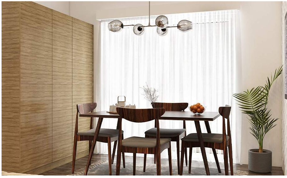
The wall color must interact directly with the permanent fixtures in the room. A massive mahogany dining table demands a different wall treatment than a sleek glass table. The undertones of the wood must complement the undertones of the paint. Pairing a warm, red-toned wood with a cool, blue-based gray wall creates aggressive visual friction. Matching the underlying temperatures creates complete spatial harmony.
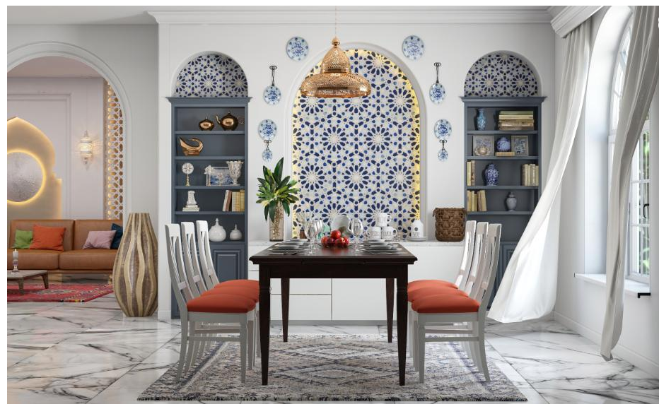
Upholstery fabrics and window treatments play an identical role. The wall color draws direct inspiration from the dominant textiles in the room. Selecting a muted shade pulled directly from a patterned rug or a heavy linen drape ties the entire architectural envelope together. The paint serves as the background canvas, elevating the furniture rather than clashing against it.
Preparing The Architectural Canvas
The final aesthetic relies entirely on the structural integrity of the drywall underneath. Slapping expensive paint over poorly sanded joints yields a cheap, amateur finish. Professional execution requires extensive surface preparation. Filling every nail hole, sanding the walls perfectly smooth, and applying a high-quality bonding primer blocks stains and creates a uniform surface for the topcoat.
Skim coating offers the ultimate structural foundation. Artisans apply a thin layer of joint compound over the entire wall, creating a surface as smooth as glass. This level of preparation is mandatory before applying high-gloss finishes, which instantly magnify the slightest drywall flaw. The time invested in the preparation phase dictates the longevity and perfection of the final application.
Executing High-End Millwork Integration
Dining rooms frequently feature complex architectural carpentry. Wainscoting, picture-frame molding, and deep coffered ceilings add historic weight to the room. Integrating the paint scheme with this millwork demands exact precision. Spraying the paint rather than rolling it provides a flawless, factory-grade finish on carved wooden details.
Homeowners undertaking massive structural renovations rely on experts in custom home building to manage the intersection of framing, millwork, and final paint application. The carpenters and the painting crews operate in perfect unison. A seamless transition between the wood paneling and the upper drywall sections guarantees the room feels permanently grounded and historically accurate.
Sourcing Professional Grade Pigments
Mass-market paints contain high levels of cheap fillers and synthetic binders. These products require multiple coats and fade quickly when exposed to direct sunlight. Professional-grade paints rely on dense, natural earth pigments. These high-quality formulas offer superior coverage, extreme durability, and complex undertones that shift beautifully as the light changes.
Investing in premium paint protects the time and labor required to complete the project. High-end formulas form a hard, protective shell that resists moisture and physical impacts from moving chairs. This investment yields a dining space that retains its sophisticated finish for decades, proving that rigorous attention to material quality delivers the highest architectural return.