warm neutral kitchens have become one of the clearest kitchen design shifts of the 2025-26 renovation cycle. The change is not simply a move from one fashionable paint color to another. It reflects a broader preference for softer neutrals, visible wood grain and cabinet layouts that create contrast without making the room feel divided. For homeowners, the practical question is how to use the trend in a way that fits daily cooking, lighting conditions, maintenance needs and the limits of a real remodel budget.
The best case for this direction is evidence-based rather than decorative hype. The 2026 NKBA Kitchen Trends Report press release said 96% of design-industry respondents identified neutrals as the most popular color family, and 59% said wood grain was becoming more popular NKBA kitchen report. Houzz also reported that wood-tone cabinets reached 29% of U.S. kitchen renovations, narrowly ahead of white cabinets at 28% Houzz kitchen trends. Those figures support a cautious reading: homeowners are not abandoning neutrals, but many are choosing warmer and more textured versions of them.
Why Warm Neutral Kitchens Are Gaining Ground
White kitchens are not disappearing, but the stark, cool-white kitchen is no longer the default reference point for many projects. Warmer versions of white, beige, greige, taupe, mushroom and soft brown can reduce the high-contrast look that sometimes makes a kitchen feel clinical under bright task lighting. Wood finishes support the same shift by bringing grain and tonal variation into surfaces that are otherwise large and repetitive.
What Warm Neutral Kitchens Change In A Remodel
For warm neutral kitchens, the main design benefit is flexibility. A creamy cabinet color can work with stone-look counters, wood flooring, muted tile and black or brass-toned hardware without relying on a sharp white-and-black formula. That does not mean every surface should be beige. A successful plan often uses warmth as the base condition, then adds controlled contrast through an island, lower cabinets, backsplash texture or hardware.
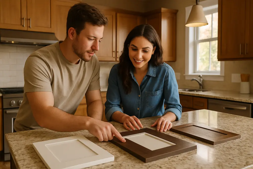
Lighting should be tested before final cabinet decisions. A cabinet door that looks soft in a showroom may turn yellow, gray or flat under a homeowner’s actual bulbs and daylight. Before ordering cabinets or paint, homeowners should view large samples at different times of day, against existing flooring and near the countertop material. This step costs far less than changing cabinet fronts after installation.
A Practical Design Brief For Everyday Use
A realistic kitchen brief might start with three questions: how much natural light the room receives, how much visual contrast the homeowner wants, and how hard the surfaces need to work. A household that cooks daily, hosts children and uses the island for homework may be better served by forgiving wood lowers or a mid-tone island than by a very pale finish on every high-touch surface. A household with limited daylight may still use wood, but it may need lighter uppers and a backsplash that reflects available light.
How Two-Tone Cabinets Can Work Without Looking Choppy
Two-tone cabinetry is most successful when it looks intentional from the full-room view, not just from a close-up sample board. The risk is a kitchen that feels split in half: light above, dark below, with no connection between the two. The safer approach is to repeat undertones. A warm white upper cabinet can connect with a white oak lower cabinet if both have compatible warmth. A muted green island can work if it relates to the countertop veining, backsplash or adjacent wall color.
Lighter Uppers And Grounded Lowers
The familiar arrangement of lighter upper cabinets and darker lower cabinets remains practical because it keeps the upper wall area visually lighter while giving the base of the room more weight. This can be useful in a smaller kitchen, where dark upper cabinets may make the room feel compressed. Wood lowers are especially practical because grain variation can disguise minor day-to-day wear better than a flat, very light painted surface.
Homeowners should avoid choosing a lower-cabinet color only because it looks dramatic in a photo. Darker blues, greens and wood stains can be attractive, but they need enough surrounding light and clear space to breathe. In a narrow galley kitchen or a room with limited daylight, a high-contrast lower cabinet may read heavier than expected. Testing sample doors vertically, not just flat on a table, gives a more accurate impression.
Island-First Contrast
For homeowners who are unsure about a full two-tone plan, the island can be the lower-risk place to introduce contrast. An island in a muted color or wood finish creates a focal point while leaving the perimeter quieter. That approach is also easier to adjust visually with stools, pendants and nearby decor than a full wall of contrasting cabinet doors.
There is still a planning caution: islands often involve electrical, lighting and sometimes plumbing decisions. Homeowners should not treat a design trend as a reason to move utilities casually. Cabinet replacement, new outlets, sink relocation, range changes and ventilation work should be reviewed with qualified tradespeople and local permit requirements where applicable.
Planning Before Paint Or Cabinet Orders
Cabinet color is only one part of a kitchen remodel. Layout, storage, lighting, ventilation, appliance clearances and safe work zones carry more weight in daily use. A warm palette can make a kitchen feel calmer, but it cannot fix poor circulation or an island that blocks appliance doors. Before choosing finishes, homeowners should confirm the measured plan and decide whether the project is a surface refresh, cabinet refacing, cabinet replacement or a broader remodel.
Sample Testing And Finish Durability
Painted cabinets and stained wood cabinets age differently. Painted finishes can show chips at corners and around pulls, while wood finishes can change visually based on grain, stain and exposure to light. The research points toward neutrals and wood grain, but it does not prove that one finish will outperform another in every household. The safer takeaway is to request finish samples, ask the cabinet supplier about care requirements and avoid selecting purely from a small screen image.
- Test cabinet samples beside the actual countertop, flooring and backsplash materials.
- View samples in morning, afternoon and evening light before approving the order.
- Use contrast on an island or lowers if the full-room view still feels balanced.
- Keep high-risk electrical, plumbing, gas or ventilation changes with qualified professionals.
Tools, Prep And Safety Boundaries
Some homeowners can handle sample painting, hardware swaps and careful planning discussions with a contractor. Cabinet installation, range-hood changes, electrical circuits, gas lines and plumbing relocations are different. Those jobs can affect fire safety, water damage risk and code compliance. If a homeowner is comparing basic project tools and prep supplies, a related resource such as HighPro Tools can support planning, but it should not replace licensed trade work for high-risk tasks.
Color planning also benefits from looking beyond one trend. Homeowners considering deeper, aged or muted finishes may find useful planning ideas in this discussion of aged kitchen colors, especially if they want a kitchen that feels settled rather than newly themed.
Cost-Recovery And Long-Term Fit

The research supplied for this topic supports a trend direction, but it does not provide a precise resale return for warmer neutrals or two-tone cabinets. That matters. A design decision should not be treated as a promise of higher sale value. A more reliable planning question is whether the kitchen will still suit the household after the first wave of enthusiasm fades.
Warm neutrals can help because they are adaptable. A beige, greige or wood-based cabinet scheme can accept changes in wall color, stools, lighting and accessories more easily than a highly saturated full-room cabinet color. Two-tone cabinets can also age well when the contrast is restrained and connected to permanent materials. The risk rises when the design depends on a very specific color pairing that may be difficult to update without repainting or replacing large sections of cabinetry.
Budget discipline is part of good design. If existing cabinet boxes are sound, a homeowner might compare repainting, refacing and full replacement with a contractor before assuming that a new cabinet package is necessary. If the layout is unsafe or inefficient, finishes should not distract from the bigger issue. Trend-responsive design works best when it improves both appearance and daily function.
Warm Neutral Kitchens And Two-Tone Cabinets
Warm neutral kitchens give homeowners a practical path between plain white cabinetry and highly expressive color. The strongest versions use creamy neutrals, natural wood, muted contrast and careful sampling instead of relying on a single dramatic decision. Two-tone cabinets can support that direction when the upper, lower and island finishes share compatible undertones and when the layout still works for cooking, storage and movement.
For a homeowner planning a 2026 kitchen update, the evidence points toward warmth, texture and restraint. Use the trend as a planning tool, not a shortcut. Start with light, layout and daily wear; test finishes in the actual room; then decide whether contrast belongs on the lowers, the island or not at all.