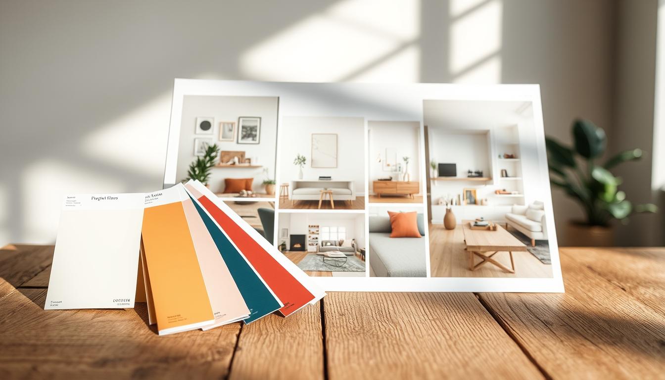
Choosing colors for your whole house can feel like a big challenge. Every beige seems to have its own secret plan.
We often stick to “safe” neutrals because we’re scared. But a great space is about finding colors that work well together.
Don’t get overwhelmed by too many paint chips. Start by looking at things you already love. Think about your favorite art, a special fabric, or even your kitchen countertops.
Consider the color of your favorite sweater. Sherwin Williams shows us, even pre-made collections start with a clear vision.
This is how you go beyond just guessing. You’ll create a mood board that brings your dreams and your home’s reality together.
This is the first step to achieving palette cohesion. It turns a messy idea into a clear plan.
Create tiered palettes base accent and statement materials
Think of your home’s material palette as a carefully curated cabinet. Each item has a distinct role. The inspirational phase was like a democratic primary. Now, it’s time for a benevolent hierarchy.
A well-governed design needs a clear structure. Enter the three-tier system: Base, Accent, and Statement. This framework transforms a mood board into a livable space.
Your Base materials are like quiet civil servants. They provide a stable, neutral background. Think walls, ceilings, and large casegoods. Colors like Sherwin Williams’ “Accessible Beige” or Benjamin Moore’s “Simply White” are perfect here.
The Accent tier adds personality without staging a coup. These are mid-tone colors, secondary finishes, and textured fabrics. A brushed nickel faucet or a slate gray tile backsplash fits here.
The Statement materials are your charismatic leaders. This is where bold, veined marble or emerald velvet makes its grand entrance. It’s the piece that defines a room’s character.
This structured approach is the backbone of your finish schedules. It provides a clear taxonomy for ordering samples and specifying products. More importantly, it ensures harmony in FF and E coordination.
| Tier | Primary Role | Typical Examples | Key Consideration |
|---|---|---|---|
| Base | Provide neutral stability for large surfaces | Wall paint, ceiling color, flooring, large cabinets | Must be a true neutral; sets the undertone for the entire scheme |
| Accent | Add supporting layers of color and texture | Tile backsplashes, curtain fabrics, secondary furniture finishes | Should complement, not match, the base; provides mid-range visual interest |
| Statement | Deliver bold character and focal points | Bold stone slabs, signature light fixtures, a colorful sofa | Must share the core undertone of the base and accent tiers |
Using pre-designed palettes as a guiding light is like having a proven political platform. It gives you a starting point. But the tiered system is how you implement that platform room by room.
Without this hierarchy, you risk a civil war between your sofa and your flooring. With it, you create a unified, governable space where every material knows its place.
Texture and sheen play matte satin polished balance and maintenance
If color is the policy, then texture and sheen are the political rhetoric—they’re what actually delivers the message to the room. A flat, matte wall is like a sober policy paper. A gleaming, polished floor is like a fiery campaign speech. Your job as the designer is to write the entire narrative, and that requires a masterful sample management strategy.
A space dressed entirely in matte finishes is like a lecture delivered in a monotone. It’s theoretically correct, but it has all the emotional resonance of a dial tone. On the other extreme, a room glittering with high-polish everything is a visual filibuster. It’s exhausting. The glare alone could start a debate.
The sage knows power lies in the balance. This is where the art of coalition-building begins. Pair the quiet, steadfast authority of matte cabinetry with the refined diplomacy of a satin brass faucet. Let a polished marble countertop negotiate a truce with a rough, nubby wool rug. The contrast isn’t conflict; it’s conversation.
But here’s the analytical truth every homeowner must confront: every sheen choice is a secret maintenance treaty. High-polish chrome shows every water spot and fingerprint like a leaked document. A honed limestone countertop might absorb a red wine stain like a scandal. A glossy painted trim highlights every imperfect wall seam. You’re not just picking a look; you’re signing up for a future of care.
This is why rigorous sample management is non-negotiable. You must observe these materials under the harsh fluorescent light of a Monday morning and the soft, forgiving glow of a Friday evening. See how that satin finish handles shadows. Watch how the matte surface drinks the light. This due diligence prevents post-installation surprises that feel like broken campaign promises.
To navigate this landscape, think of sheens as having distinct personalities and constituencies. The following table breaks down the coalition.
| Sheen Level | Character Vibe | Maintenance Reality | Prime Real Estate |
|---|---|---|---|
| Matte/Flat | The thoughtful intellectual. Hides flaws, absorbs light, creates calm. | Can be difficult to clean; may show scuffs and stains more readily than a sheen. | Ceilings, adult bedroom walls, cabinetry in low-splash zones. |
| Satin/Eggshell | The pragmatic diplomat. Offers a soft glow, balances durability with elegance. | Strikes the best balance; generally wipeable and good at hiding surface imperfections. | Walls in high-traffic areas, kitchen cabinets, bathroom vanities. |
| Polished/Gloss | The charismatic orator. Reflects maximum light, creates drama and depth. | High-maintenance; shows every dust particle, fingerprint, and surface flaw. | Statement flooring (terrazzo), kitchen backsplashes, decorative plumbing fixtures. |
Your sample management process is the campaign trail for these materials. Lay your marble slab next to your wood stain. Place your faucet finish against your cabinet pull. View them at noon and at night. This hands-on analysis is what separates a cohesive, enduring design from a jarring, high-maintenance mistake. It’s the critical step that ensures your material choices, from sheen to texture, work in harmony—much like choosing a perfect color palette—before you ever sign a contract.
Scale and repetition motifs that carry through doors floors lighting
Ignoring hallways and staircases in design is like making a great plan that never gets used. These areas are the heart of your home, where your design must shine. Scale and repetition are key here.
Repetition is like the power of good design. It’s not about everything looking the same. It’s about picking a key visual and using it everywhere. This creates a through-line, tying everything together.
What does this look like? Maybe it’s a square pattern in cabinet pulls, tile, and sconce frames. Or a unique wood grain in flooring, doors, and dining table legs.
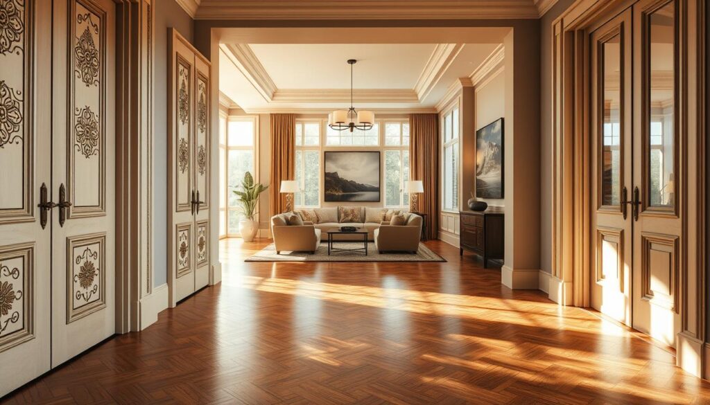
Experts say using the same metal finishes and trim is a classic way to keep things cohesive. Brushed nickel on faucets, handles, and curtain rods? That’s a unified look. It’s a promise your home keeps.
Another expert warns: don’t let your design fade in hallways. They’re not just pass-throughs. They’re key spots to show your design. Using the same basket style for storage or curtain fabric on all windows? These details solidify your design’s legacy.
This careful use of repetition makes a big difference. It turns a collection of nice rooms into a home with deep palette cohesion. Your home should feel like it was meant to be this way.
FF and E alignment upholstery rugs casegoods harmonious transitions
Think of your Furniture, Fixtures, and Equipment as a nomadic population with diplomatic immunity. They don’t answer to your walls. Their free migration from room to room is the ultimate audit of your design policy. If your FF and E coordination is solid, that armchair from the study can defect to the living room during a family gathering and fit right in. It’s the final, moving layer of your whole-home palette.
This isn’t about static perfection. It’s about creating an aesthetic ecosystem where pieces can circulate. Does that linen sofa converse easily with the walnut console? Does the tribal rug negotiate a peace with the mid-century modern chair? Each piece must be a citizen of the same visual nation.
Your curated color and material palette should act as the visa requirement for any item entering your home. As one designer noted, using a Sherwin Williams card as a “guiding light” for throw pillows, bedding, and rugs ensures every accessory has the right papers. Another source extends this logic to furniture, upholstery, tile, and artwork. The palette is the constitution; the FF&E are the citizens.
Let’s break down the diplomatic corps. Upholstery fabrics are the soft-power ambassadors. Their texture and hue must align with your wall colors and fixed finishes. A velvet navy blue sofa should feel at home against a matte grey wall, not like a tourist in the wrong country.
Rug patterns and colors are the floor treaties. They anchor a space but must also play well with migrating furniture. A bold, geometric rug in the dining room should also make sense if a side chair is temporarily relocated to the kitchen nook. The pattern is a commitment; the palette ensures flexibility.
Casegoods—your tables, consoles, and cabinets—are the infrastructure. Their wood tones, metals, and finishes are the permanent records. A cherry wood dining table and an oak sideboard might start a trade war if their undertones clash. Consistent material choices prevent these conflicts.
So, how do you achieve this fluid FF and E coordination? It requires a strategic, almost political, approach.
| Tactic | Haphazard Approach | Coordinated Strategy |
|---|---|---|
| Color Adherence | Buying a “pretty” rug in isolation. | Using your master palette swatches to vet every rug pattern against your wall and upholstery colors. |
| Material Diplomacy | Mixing oak, walnut, and maple woods randomly. | Choosing one primary wood tone (e.g., walnut) and one accent metal (e.g., brushed brass) as standards for all casegoods. |
| Texture Treaty | Pairing a nubby bouclé chair with a slick leather sofa. | Balancing matte, textured fabrics with polished surfaces according to a pre-set sheen ratio from your palette. |
| Scale & Motif Accord | Large floral upholstery next to a tiny geometric pillow. | Ensuring pattern scales relate, carrying a motif (like a stripe or organic shape) through different FF&E pieces. |
The goal is harmonious transitions, not jarring border crossings. When you walk from your living room to your study, the journey should feel continuous. The blues in the rug should whisper to the blues in the adjacent room’s artwork. The wood grain on a floating shelf should be a cousin to the grain on a mobile bar cart.
This turns a house from a collection of rooms into a unified territory. It feels curated, not assembled by a committee with no shared vision. Your FF and E coordination is the silent diplomacy that makes your home work. It’s the policy that allows for beautiful, spontaneous rearrangements without an aesthetic crisis.
Get this right, and your furniture won’t just fill space. It will belong.
Wet spaces vs dry spaces slip resistance and cleanability
Think of your bathroom as a bipartisan committee. Every material must pass a vote on safety and maintenance, based on your finish schedules. It’s not just about design; it’s about policy.
Wet spaces like kitchens and bathrooms are high-traffic areas. Here, looks must meet physics’ demands. A polished marble floor might look great in a showroom. But add water, and it becomes a problem fast.
Your finish schedules in these areas need to be practical. Slip resistance is key. It’s the first defense.

Textured porcelain, matte tiles, or sealed natural stones are good choices. They offer grip without losing style.
Cleanability is also critical. Materials like encaustic cement tile are beautiful but absorb spills. Your finish schedules must include a high-quality sealant.
Dark faucets add drama but show water spots and mineral deposits. In wet zones, your specs must account for hard water. It’s a daily challenge.
Dry spaces like living rooms offer more freedom. You can choose plush rugs or delicate upholstery. The risk of slips is lower.
But don’t think you’re off the hook. Maintenance is important. A light-colored sofa in a family room is a bold move. Your finish schedules in dry areas should consider cleanability and wear.
Start by analyzing your home’s traffic patterns. Where does water flow? Where do spills happen? Map these areas like a strategist maps districts.
Then, create your material specs like infrastructure bills. They must last, survive, and serve the public. Your finish schedule is a contract with reality.
Children pets and reality performance specs that stil look elevated
Your Labrador’s joy and your toddler’s creativity shouldn’t mean a dull home. For too long, “family-friendly” meant boring and durable. It was a mix of ugly and long-lasting.
That’s changed now. Modern design has found a better way. We have fabrics and finishes that can handle spills and messes, yet look stylish.
Brands like Crypton, Perennials, and Sunbrella are leading the way. They offer materials that resist stains, protect against germs, and don’t fade fast. And they feel great to touch.
Choosing the right materials is key. Don’t just look at swatches. You need to test them under real-life conditions.
- Spill a drop of coffee (or merlot) on it.
- Let the dog claim it as a nap spot for a week.
- Rub a cracker into the weave.
See how it holds up. This isn’t being negative. It’s about making smart choices based on how things will really be used.
Here’s the magic part. You can have a calm, stylish master bedroom and a tough family room with the same colors. The key is to adjust the performance specs for each area. Use a velvet-like fabric for the sofa and a scrub-resistant paint for the walls.
The goal is to pick materials that are both beautiful and strong. They should look good and feel welcoming, yet be ready for the messes of everyday life. It’s about creating a space that’s both peaceful and playful, without sacrificing style.
Budget alignment value tiers and alternates pre approved
Think of your mood board as a financial plan for your project. It’s not just a collection of pretty pictures. It’s a way to show your design plan’s value to the budget committee.
It’s smart to have many options, not just one perfect material. For example, instead of just Calacatta Gold marble, consider a durable quartz or a cost-effective porcelain slab. This way, you can offer different options to fit your budget.
Studies, like one from Sherwin Williams, show that starting with a pre-designed palette saves time and energy. It helps avoid indecision and keeps your project on track. Before choosing a finish, know its cost and have a backup ready.
This approach helps you avoid delays and budget overruns. Now, let’s talk about creating your material list.
| Material Tier | Primary (The “Dream”) | Approved Alternate 1 | Approved Alternate 2 | Key Budget Impact |
|---|---|---|---|---|
| Countertop | Natural Marble Slab | Veined Quartz | Porcelain Slab | High to Moderate to Low |
| Flooring | Wide-Plank Hardwood | Engineered Wood | Premium LVP | High to Moderate to Low |
| Cabinet Hardware | Solid Brass, Hand-Forged | Lacquered Brass-Finish | Brushed Nickel | High to Moderate to Low |
| Statement Lighting | Designer Pendant | High-Quality Replica | Updated Vintage Find | High to Low to Variable |
This table is about smart planning, not settling. When budget talks get tough, you can switch to a more affordable option. For example, choosing quartz instead of marble can save money for custom millwork.
The real power is in pre-approval. By choosing all options during the mood board phase, you keep your design vision. Even if you change materials, your overall look stays the same. It’s a smart move, not a compromise.
Documentation spec sheets takeoffs submittals and signoffs
You’ve picked the perfect colors; now it’s time to make it official. This is where spec sheets and submittals come in. They’re like the rules and paperwork of your design project. They keep everything running smoothly on the jobsite.
Spec sheets are your official manifestos. They’re not just pretty pictures. They list every detail, from finishes to suppliers. “Brushed Brass” from one company is different from “Antique Brass” from another. The spec sheet clears up any confusion, making sure your FF and E coordination is perfect.
Then, there’s the takeoff. This is where you figure out how much of each item you need. It’s like making a shopping list for your project. It helps avoid last-minute problems with suppliers.
Submittals are when you see the actual materials. This is your chance to approve the tile, wood stain, or fabric. It’s your last say before everything is ordered in bulk. You must give a thumbs up or thumbs down.
The signoff is the final approval. It’s like the official agreement that says, “Yes, this is what we agreed upon.” This document makes sure everyone knows who’s responsible. If there’s a mistake, the spec sheet and submittal prove it.
This process turns your dream into a real, accountable project. It’s the professional touch that makes a big difference. It’s all about following design first principles. Think of it as your project’s constitution. Without it, your project is just a dream with no way to make it real.
Final review full house walk with boards under actual light
This is your design’s final test, under the sun’s watch. Walking through your home with mood boards is serious. You check everything at dawn, noon, and dusk. Light shows what’s really there, like hidden colors.
Design experts say to see swatches in your home. Your 3-5 color palette is put to the test. Does the living room’s wall match the hallway’s trim in the afternoon light? This is the key to a good color scheme.
Your goal is a smooth look, where nothing clashes. J. Siemering Homes suggests testing under different lights. This makes sure your home looks great in every light. When everything works together, you’ve succeeded. Your home is ready for you.