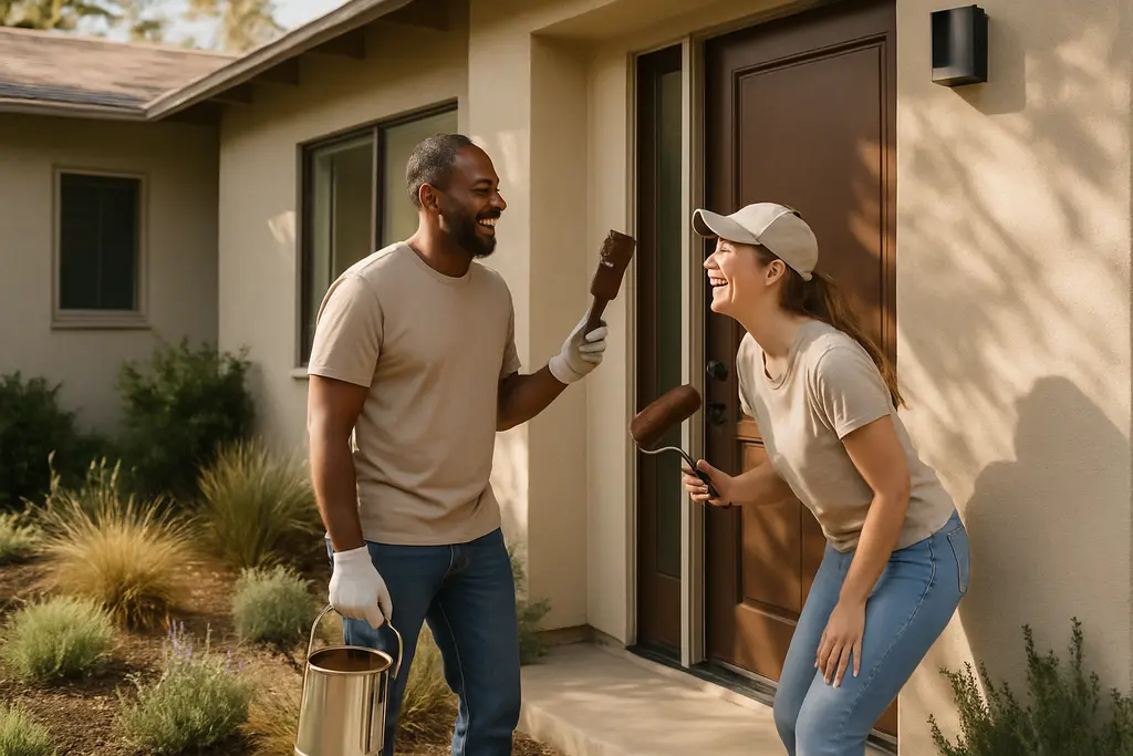
Warm neutrals are no longer just a quiet interior paint choice. In 2026 exterior design reporting, beige, taupe, cream, greige and softened off-white are showing up as practical alternatives to stark white and cool gray. For everyday homeowners, the useful lesson is not that every house should be repainted beige. It is that softer, earth-based exterior colors can support a calmer facade, work with textured materials and make trim decisions more deliberate.
The data behind the trend is stronger than a few attractive project photos. The 2026 U.S. Houzz Outdoor Trends Study, surveyed from April 25 to May 6, 2026, reported that beige became the most popular exterior wall color among homeowners, rising to 24% of selections from 10% in 2024, according to Houzz exterior trend data. That is a sharp shift, but it still leaves most homeowners choosing other colors, so the trend should be treated as a planning signal rather than a rule.
Why Warm Neutrals Are Moving Onto Exteriors
Reading The 2026 Color Data Carefully
The clearest finding from Houzz is the rise of beige as an exterior wall color. The same research also reported black as the top trim choice, selected by 39% of homeowners, while 69% favored contrasting trim and wall colors. That pairing matters because beige or creamy off-white can look flat if every adjacent surface is too similar. Contrast gives windows, rooflines, doors and porch details more definition without relying on a high-risk color decision.
Design commentary has also pointed toward softer earth-based tones. Forbes reported in January 2026 that consumers and designers were favoring shades such as cream, taupe, mushroom, oatmeal and sand over brighter decorative color stories, and noted 2026 color choices from major paint brands including Universal Khaki, Silhouette, Melodious Ivory and Coffee Bean in its neutral color reporting. Those examples are useful because they show the direction of the market: grounded tones, softer whites and deeper brown-black accents.
What The Warm Neutrals Shift Does Not Prove
Warm neutrals may be more popular in 2026, but popularity does not prove that a color will improve every facade, increase resale value or age well in every climate. A cream that looks calm on a shaded stucco home may look washed out on a full-sun elevation. A taupe that suits stonework may clash with an existing roof. Homeowners should separate trend awareness from project approval. The better test is whether the color works with fixed elements that are expensive to change: roofing, masonry, windows, garage doors, gutters and hardscape materials.
Planning Color Pairings Before Painting
Using Warm Neutrals With Contrast
Using warm neutrals well starts with contrast planning. If the siding or stucco body is beige, oatmeal or greige, trim can move darker, softer or cleaner depending on the house. Houzz’s 39% black trim finding helps explain why many homeowners are pairing light walls with dark accents, but black is not automatically the safest choice. On some homes it can emphasize awkward window proportions or make small trim pieces feel visually heavy.
A cautious approach is to test body color, trim color and door color together, not one at a time. Paint samples should be viewed near existing stone, brick, roof edges and shaded porch areas at more than one time of day. Small sample boards are often more useful than tiny swatches because exterior light changes the apparent depth of beige and off-white. Homeowners should also check any neighborhood review rules or local requirements before committing to visible exterior changes.
Coordinating With Doors, Gutters And Fixed Materials
Exterior color decisions become more reliable when the least flexible items lead the plan. A brown roof, tan stone base or cream garage door may support a sand or taupe wall color. A cooler gray roof may need a greige that does not read too yellow. Gutters and downspouts can either blend into the body color or align with trim, but the choice should be intentional. Randomly mixing white gutters, black windows, beige walls and stained wood can create a facade that feels pieced together.
For homeowners comparing outdoor materials, finishes and project sequencing, a related planning resource on outdoor design is available through HighProTools, which can help connect exterior color choices with seating, shade and lighting decisions. Paint rarely works in isolation; it is part of how the front entry, porch and outdoor living areas read as one property.
Materials And Texture Change The Result
Stucco, Wood, Fiber Cement And Vinyl Read Differently
Houzz reported that stucco appeared in 28% of 2026 exterior renovation projects surveyed, while natural wood, fiber cement and plastic or vinyl each appeared in more than 20% of projects. That material mix explains why beige and related shades do not produce one uniform look. Smooth stucco can make a creamy exterior feel quiet and monolithic. Wood accents can add warmth, while fiber cement lap siding may emphasize shadow lines. Vinyl color choices may be more limited, so homeowners should confirm available manufacturer colors before assuming a custom paint palette is possible.
Texture also affects maintenance expectations. A smooth painted surface may show dirt, staining or patching differently than textured stucco or multi-tone masonry. The research supports the popularity of layered materials, but it does not remove the need to choose products based on the home’s exposure, age and condition. If siding is damaged, loose or water-stained, repainting should not be used as a cosmetic cover for a building-envelope problem.
Accent Colors Should Support The Architecture
Earth-inspired accent colors such as sage and clay were noted in 2026 trend reporting from the supplied research, but accents should be limited to areas that can carry attention: front doors, shutters where appropriate, porch ceilings, planters or small architectural features. A modest accent can keep a neutral exterior from feeling dull. Too many accent points can compete with the facade and make future touch-ups harder to manage.
Budget, Safety And DIY Boundaries
Where Homeowners Can Reasonably Participate
Many homeowners can help with planning, sample review, documentation and basic product comparison. Taking clear photos of each elevation, listing fixed materials and collecting paint samples are low-risk tasks that improve decision-making. Homeowners can also compare brushes, rollers, masking tools and surface-prep supplies through practical tool references such as HighProTools, especially when deciding what is appropriate for small touch-ups versus a larger exterior job.
The safety boundary is equally clear. Exterior painting can involve ladders, roof edges, pressure washing, scraping, repairs near electrical service equipment and work at heights. Those conditions raise the risk level. If a project involves upper stories, failing siding, suspected hazardous coatings, major stucco repair, window flashing issues or structural deterioration, homeowners should bring in qualified professionals. Color cannot compensate for unsafe access or unresolved water intrusion.
Cost Recovery Should Not Be Assumed
A fresh exterior can affect how a home is perceived, but the research supplied here does not establish a specific return on investment for repainting with beige, taupe or cream. That distinction matters. Homeowners planning to stay for several years can prioritize durability, compatibility and personal comfort. Owners preparing a sale should avoid claims that any color choice is certain to produce a specific price outcome. A restrained neutral palette may broaden appeal, but local market conditions, home condition and buyer preferences still matter.
Practical Takeaways For Warm Neutrals Outside
The strongest practical case for warm neutrals is not that they are fashionable. It is that they give homeowners a flexible middle ground between stark white, cool gray and saturated color. In 2026 data, beige rose sharply, contrasting trim gained favor and mixed exterior materials remained common. Together, those findings point toward facades that use softer body colors, clearer trim definition and more attention to texture.
The best next step is measured rather than dramatic: test colors against the roof and masonry, choose trim at the same time as the body color, respect the home’s existing materials and set a firm DIY safety limit. A well-chosen neutral exterior should look intentional on an ordinary Tuesday, not just in a staged photo. That is where the current trend becomes useful for real homes.