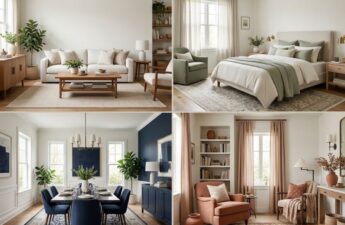
Most homes look like they were designed by a chaotic committee with no clear vision.
Imagine a chrome faucet next to a brass doorknob. Your floor tile and kitchen countertop might fight for attention. It’s a mess of colors and textures.
Before buying anything, you need a clear story. Not just “I like modern farmhouse,” but a specific three-word story. Is it “Organic, Textured, Serene” or “Bold, Graphic, Retro”?
This isn’t just a fancy phrase. It’s your design guide. I’ve seen many design fails, and they all lack a strong idea.
We’ll find your overarching vision. This vision will guide every choice you make. It will help pick materials and finish schedules. This step is like starting with a whole-home mood board.
Think of it as the theme for your space. It makes sure everything looks good together, from the foyer to the back porch. Your throw pillows and cabinet hardware will get along.
Build a Master Finish Matrix Room by Room with Hierarchy
Forget vague inspiration. The real work starts when you make a detailed plan for each room. This isn’t just a list. It’s your master finish matrix—the guide that keeps your home looking great.
Think of it as the periodic table for your project. Each room is a column. Each material category is a row. The cells show your choices. This helps you see if your rooms will match well.
The goal is intelligent variation, not the same look everywhere. Hierarchy is key. You need to pick what stays the same, what changes, and what adds a special touch.
Your constant is the element that stays the same, like flooring. Your variable is what changes, like wall paint. Your accent is the special touch, like a bold light fixture.
This way, you get consistency without being boring. Your finish schedules stay flexible. This lets each room show its own personality while keeping the whole house in harmony.
Let’s make it concrete. Below is a simplified matrix for a main floor. The flooring is constant, while wall color and countertops change. The hardware metal adds a special touch.
| Material Category | Kitchen | Living Room | Powder Room |
|---|---|---|---|
| Flooring (Constant) | White Oak, Natural Finish | White Oak, Natural Finish | Terracotta Tile (Accent) |
| Wall Color (Variable) | Warm White | Light Greige | Moody Green |
| Countertop | Quartzite with subtle veining | N/A | Solid Surface Vanity |
| Dominant Metal (Accent) | Brushed Nickel | Brushed Nickel | Matte Black |
Notice the flow? The flooring connects the kitchen and living room smoothly. The wall color changes to set each area’s mood. The powder room stands out with its own floor and metal, but shares the kitchen’s brushed nickel.
This matrix forces you to make choices. It turns “I like both” into a clear choice with visual results. Your finish schedules become a plan for a cohesive, curated home.
Metals and Mixes When to Match When to Contrast and Why
Mixing metals in home design is more about creating harmony than following rules. The idea of using only one finish everywhere is outdated. Today, we focus on creating a unique look through metal mix guide curation.
Think of your metal finishes like jewelry for your home. The wrong combination can be jarring. Aim for a balanced and intentional look.
Begin by picking a dominant metal. This is your main choice. Maybe it’s warm, evolving brass or soft, shiny nickel. Use this finish for key, hard-to-change items.
Next, choose a secondary or contrasting metal. This adds depth and interest. Matte black is clean, while satin bronze brings earthy tones.
The key is to plan carefully. It’s not about randomness, but a thoughtful mix.

Use your dominant metal for permanent fixtures. This includes faucets, showerheads, and towel bars. It sets a consistent base.
Then, add your contrasting metal to items you can change. This includes cabinet pulls, lights, and decorative pieces. This mix adds variety and interest.
This approach makes your space feel more personal and collected. It tells a story of layers and time.
Match finishes within fixture families. For example, all your kitchen faucets should match. This creates a polished look.
Contrast across different categories and sizes. Your brass faucet can pair well with black cabinet hardware. Polished nickel fixtures can be complemented by a satin bronze mirror frame.
A good metal mix guide focuses on creating a sophisticated look. The relationship between finishes should be clear and intentional.
The sheen of your finishes is just as important as their color. Mixing sheens within the same metal family adds texture and interest.
Your finish palette is a powerful design tool. It guides the eye and defines each space’s character. Break free from the monochrome rule and embrace the mix. Your home will appreciate the complexity.
Stone and Tile Veining Scale and Layout Patterns for Flow
Your home’s geology shouldn’t look like a collision zone. Yet, choosing tile and stone without thinking about how they work together can cause this. These materials are the foundation of your home’s look. They need to converse.
Think about scale and drama. A big, veined marble in the master bath is stunning. But a small, quiet limestone in the hallway is more subtle. Together, they might make the hallway feel forgotten. Your materials should look like they belong together, even if they play different roles.
Vein direction and layout patterns are key. They help guide the eye. A running bond tile pattern is like a path, leading the eye down a hall. A large slab with horizontal veining can make a narrow space look bigger. It’s a subtle magic.
Choosing the right pattern is important. It connects spaces with a “texture language.” Your pattern choice answers a room’s needs. For more on this, explore what wall tile patterns make a room look.
| Pattern Name | Visual Effect | Best For | Scale Consideration |
|---|---|---|---|
| Running Bond | Creates a strong directional line, guiding sight. | Hallways, elongated spaces. | Works with small to medium tile; grout lines enhance the direction. |
| Large-Format Slab | Minimizes seams, promotes calm, can emphasize vein movement. | Statement walls, shower surrounds, floors for a spacious feel. | Demands a large room; in small spaces, it can feel overwhelming. |
| Herringbone | Adds dynamic energy and vintage texture. | Entryways, kitchen backsplashes, powder rooms. | Smaller tile often works best; pattern is busy, so balance with simple surrounds. |
| Stacked (Grid) | Offers a clean, modern, and stable grid. | Contemporary kitchens, bathrooms seeking a serene look. | Large tiles in a grid feel serene; small tiles can feel retro. |
Think of it like a film score. A great composer uses motifs to tie scenes together. Your vein direction and tile pattern are your home’s visual motifs. They create rhythm across your floor plan.
The final rule? The pattern’s scale must match the room’s. A huge, bold pattern in a small room is too much. A tiny, detailed pattern in a big room gets lost. It’s about harmony.
Your goal is a family of materials, not a series of one-hit wonders. Make your stone and tile selections so cohesive that moving from kitchen to hall to bath feels smooth, not jarring.
Wood Species Stain and Sheen Coordinating Across Spaces
Think of your home’s wood finishes like a family reunion. You want everyone to look like they belong together, not like strangers. Aim for a look that’s subtly consistent, not too perfect.
Choosing your flooring first is key. This is your primary wood species. Pick something like white oak or red oak. Then, your other wood pieces can play supporting roles.
When adding other wood species, think about undertones. Is your main wood warm or cool? Mixing a warm floor with cool cabinets might not work well. It’s like mixing a folksy guitar with a synth bass.
After picking your wood species, decide on stain and sheen. A matte floor and glossy island might clash. Make sure your sheen levels match across spaces.
Your finish schedule is your secret weapon. It keeps everything in harmony. Document your choices, like “Flooring: White Oak, Natural Oil Finish, Matte Sheen. Kitchen Cabinets: Walnut, Light Transparent Stain, Satin Sheen.” This way, you avoid confusion.

Understanding undertones is key. Not all browns are the same. Knowing if you prefer warm or cool tones makes choosing easier.
| Undertone Family | Common Species | Typical Stain Colors | Pairs Best With |
|---|---|---|---|
| Warm | Red Oak, Cherry, Mahogany, Teak | Golden Oak, Early American, Provincial | Brass, gold, and oil-rubbed bronze metals. Creamy off-white paints. |
| Cool | White Oak, Ash, Maple, Walnut (often) | Natural, Gray Wash, Weathered Oak, Ebony | Chrome, nickel, and black iron metals. Gray or pure white paints. |
| Neutral | Hickory, Bamboo, Some White Oak | Light Natural, Classic Gray, Simply White | Flexible; can bridge warm and cool palettes. |
Your finish schedule should use this guide. It helps you plan your wood choices. For example, if you have cool-toned floors, your vanity might be cool maple, not warm cherry.
This isn’t about being boring. It’s about creating a curated look. A walnut table and white oak floor work because they match in sheen and undertones. The goal is a home that looks thoughtfully put together, not thrown together.
Paint Palette Strategy Undertones Light Testing and Sheen Maps
Choosing paint colors without a plan is like trying to build IKEA furniture without the instructions. It’s possible but can be very frustrating. Paint is the cheapest way to make your home look good or bad. The look of your home depends a lot on its color story.
Choosing a color from a small chip in a store is like online dating with just one photo. You might be very disappointed. The color might look great in the store but not in your home.
Undertones and light can cause problems. That “greige” color you like might have a green or pink undertone. Light from the north can make colors look cool and blue. Light from the south can make them look too bright.
Sheen is also important for a professional look. I suggest making a sheen map for your whole home. Different sheens reflect light and wear differently. A good map adds depth and makes your home look designed.
Think of your home’s colors like a classic cocktail recipe. The 60-30-10 rule is a good guide. Sixty percent of your space should be a neutral color. Thirty percent is a secondary color, and ten percent is for bold accents.
This rule helps your home look good without being too samey. But, you need to test it in real life.
For the love of sanity, test paint swatches big time. Paint a 3×3 foot square on walls in the room. Check it at different times of day and under artificial light. Your “perfect warm white” might look different in different lights.
To choose the right sheen, here’s a quick guide. This table helps you make a sheen map for your home.
| Sheen Type | Best For | Light Reflection | Durability & Cleanability |
|---|---|---|---|
| Flat/Matte | Ceilings, low-traffic adult spaces | Minimal; hides surface imperfections | Low; difficult to clean without marking |
| Eggshell | Most interior walls, living rooms, bedrooms | Soft, velvety glow | Medium; more washable than flat |
| Satin | Trim, moldings, kitchens, bathrooms | Gentle pearl-like luster | High; stands up to frequent cleaning |
| Semi-Gloss | Doors, cabinetry, high-moisture areas | Noticeable shine | Very High; extremely durable and wipeable |
Don’t fall in love with a paint chip too quickly. Creating a good color story for your home is a detailed process. It involves understanding light, undertones, and sheen. It makes your home look like it was designed, not just painted.
Plumbing Fixtures Form Factor Ergonomics and Water Performance
A fixture that looks great but doesn’t work well is a big mistake. This part of our cohesive fixtures and finishes guide tests your design vision. It’s a real test.
First, look at the form of your fixtures. Are they smooth and curved or sharp and straight? They should all look like they belong together. A fancy faucet in the kitchen should match your shower, not look out of place.
But looks aren’t everything. Your fixtures must also perform well. A rain showerhead should really spray water, not just a little. Check the GPM (gallons per minute) to make sure it’s strong. Your faucet should fit perfectly with your sink, so you don’t have to clean up spills all the time.
Ergonomics is key. A good handle makes it easy to turn on the water. The height and reach of the spout matter too. They should make using your sink easy and comfortable.
Think of spray patterns like choosing a camera lens. Do you want a strong spray or a soft mist? Your shower should feel like it’s made just for you. These choices affect your daily life more than any color on your walls.
Choosing fixtures is more than picking pretty things. It’s about finding tools that work well with your life. Do your fixtures support your habits, or do you have to adjust to them? A cohesive home makes everything work smoothly.
This guide helps your plumbing be more than just decorations. It makes your home run smoothly and look great. Your fixtures should be both beautiful and functional.
Hardware Lighting and Accessories Tying the Palette Together
This is where your metal mix guide comes to life. It turns a plan into real, touchable parts. Think of hardware, lighting, and accessories as the final touches of your design. They make your home flow smoothly, like a well-written story.
Let’s talk about hardware. Your cabinet pulls, door knobs, and curtain rods should look good together. They don’t have to be the same, but they should match in style. For example, a brushed nickel faucet in the kitchen should match the matte black cabinet pulls in the pantry.
To get this right, use a hierarchy. Big items like faucets and lighting fixtures lead. Smaller items like drawer pulls follow in a matching finish. Use this table to help you apply your guide.
| Hardware Type | Recommended Finish (From Guide) | Coordination Note |
|---|---|---|
| Primary Faucets & Showerheads | Dominant Metal (e.g., Brushed Brass) | Sets the tone for the room; be bold here. |
| Cabinet & Door Hardware | Complementary or Secondary Metal | Can contrast for definition or blend for subtlety. |
| Lighting Fixtures (Sconces, Pendants) | Echo Dominant or Complementary Metal | Key for visual flow between spaces. |
| Switch Plates & Vents | Match Cabinet Hardware or Wall Color | Often overlooked; unifying them is a pro move. |
| Decorative Accents (Mirror frames, shelf brackets) | Use Secondary Metal or a Dark Finish | Adds depth without overwhelming. |
Lighting is key for a cohesive look, and it’s mostly invisible. The most important rule? Consistent light temperature. Mixing warm and cool bulbs in one area is a big mistake. It’s like having jazz and metal music playing at the same time.
Stick to warm bulbs everywhere. This makes your home feel connected, even if the colors are different. Your eyes won’t jump from one light color to another as you move around.
Accessories let you whisper your color story. They create smooth transitions. For example, a rust-colored vase in the living room that matches the terracotta tile in the kitchen? That’s intentional design. A throw pillow with the same blue as your bedroom wall in the den? That ties rooms together.
These items—books, art, textiles—add personality. They highlight and add depth to your design. They don’t have to match, but they should relate.
When your hardware, lighting, and accessories all work together, magic happens. Rooms stop fighting for attention and start working together. These final touches turn a house into a home with a soul.
Procurement Realities Lead Times Alternates and Hold Strategies
If your finish matrix is like a symphony, procurement is the grueling, underpaid stage manager who ensures the instruments arrive on time. This phase is the unsexy, non-negotiable foundation of your project. Without mastering this logistical puzzle, your vision remains a fantasy.
Let’s be blunt. Lead times are not suggestions. They are prophecies etched into purchase orders by the gods of global manufacturing and shipping. That perfect, hand-glazed tile? Sixteen weeks. The custom cabinet pull you sourced from a small artisan? Twelve weeks, if you’re lucky. Treat every date as gospel.
Your first move is to build a schedule that runs backward from your project start date. When does the flooring installer need to be on site? Work back from there, adding buffers for customs, trucking, and the inevitable “Oops.” This backward timeline is your single source of truth.
More critically, you need a Plan B for every star player. What if your chosen stone slab is held in quarantine? What if the light fixture is discontinued between your sample approval and your purchase order? This isn’t pessimism; it’s professional-grade chess. Identify and source approved alternates for all critical items before you need them.
The savviest strategy is the “hold.” This means identifying items with long procurement lead times early—often before you’ve finalized paint colors—and placing a refundable deposit to secure your place in the production queue. It’s like buying a ticket to a sold-out show. You might change your seat later, but you’re guaranteed to get in.
Think of it this way. Your faucet, your tile, your hardware—they aren’t just objects. They are dates on a calendar. Managing these procurement lead times is what separates a stressful, compromised renovation from a smooth, visionary one. It’s the difference between a project that flows and one that sputters to a halt, waiting for a box to arrive from overseas.
So, embrace the thunderdome. Master your schedule, secure your holds, and have your alternates ready. Your future self, calmly sipping coffee in your finished kitchen, will thank you.
Samples Boards and Mockups Approve Before You Order
Your digital renderings are beautiful mirages. Your small material chips are polite liars. The only truth lives in a physical sample board assembled in the actual light of your space.
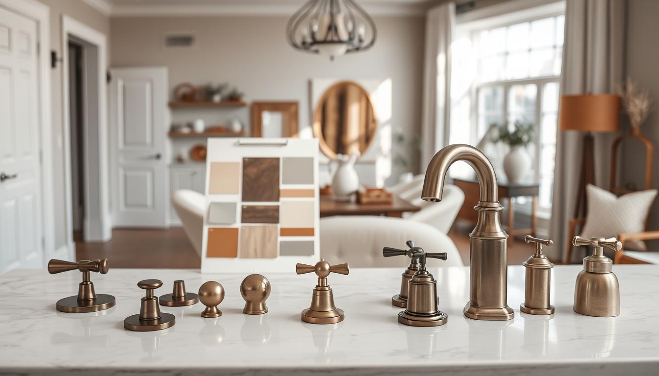
Build this board like a detective building a case. Tape your flooring, countertop slab, cabinet finish, paint swatch, and metal samples together. Stick it on the wall. Live with it for a week.
Watch the morning light turn your warm brass green. See if that perfect gray paint whispers a hint of lavender. This is where your master finish matrix gets its final audit.
For your tile and stone selections, you must go further. Create a full mockup of the layout on a spare wall or floor section. See the grout joint width in real life. Feel the texture under your thumb.
This hands-on test is the ultimate validator for your tile and stone selections. It reveals scale and pattern in a way a catalog never can.
Consider this your last creative edit before the expensive, irreversible production phase. It transforms design anxiety into unshakable confidence. You are not just approving materials. You are signing off on a guarantee.