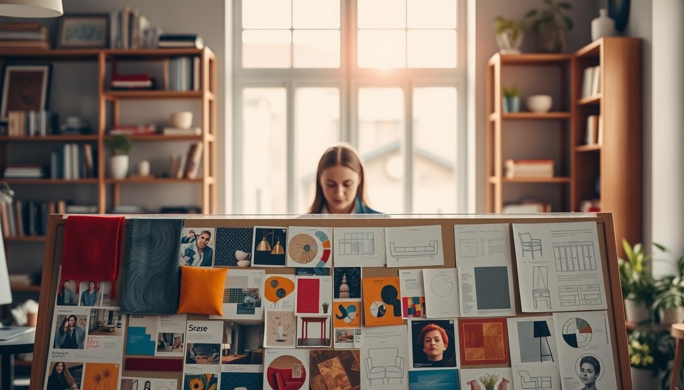
Let’s be honest. Most visual collages start as a chaotic Pinterest rabbit hole. They end with 47 tabs open and a creeping sense of imposter syndrome. We’ve all been there.
But what separates a pro from an amateur isn’t just a good eye—it’s a ruthless methodology. This section is where we establish the emotional DNA of your project. Think of it as writing the opening line of a novel.
We begin not with images, but with language. Define three to five precise, evocative words that encapsulate your intended atmosphere. Is it “Jetset Minimalist,” “Coastal Grandma,” or “Brutalist Bauhaus”?
Terms like ‘serene,’ ‘dynamic,’ ‘organic,’ or ‘structured’ become your non-negotiable filters. This verbal triangulation is your first act of curation.
It’s palette storytelling before a single Pantone chip is chosen. This foundational step transforms a moodboard from a scattered collection into the ultimate tool. It brings your creative vision to life. It anchors whimsy in intention.
Start with a narrative three mood words and reference images
Your project’s core is built from just a few adjectives. It’s a simple yet powerful guide for your senses. Before diving into Pinterest or magazines, you need a filter. This filter is your set of three to five mood words.
Think of these words as your creative thesis. Are you aiming for Urban Zen, Jetset Retro, or Organic Brutalism? You need to find images that match your mood words. This process requires discipline and an open mind.
Now, let’s use those words to guide us. This is where your stylist and librarian meet. For example, if your word is “Organic,” you’re not just looking for plants. You’re searching for evidence.
What does “Organic” look like in real life? It might be moss-covered stones or the grain of a walnut slab. Each image supports your visual argument.
The goal is to have a cohesive narrative. You’re not collecting random pictures. You’re building a case. Does your “Urban Zen” board show both concrete and spa interiors in harmony?
This phase turns a mood board into a concept board. A mood board shows feelings. A concept board makes a point of view. It argues for a specific atmosphere and materials.
To see the difference, let’s look at strong and weak mood word applications:
| Mood Word Trio | Strong, Cohesive Image References | Weak, Scattered Image References |
|---|---|---|
| Serene, Textured, Monochromatic | Rippled plaster wall, raw silk swatch, fog over a lake, honed marble detail. | A calm beach (serene), a burlap close-up (textured), a black and white city photo (monochromatic but chaotic). |
| Energetic, Geometric, Saturated | Bold terrazzo, Memphis Group furniture, vibrant tile, colored glass sunlight. | A sports car (energetic), a graph paper sketch (geometric), a fruit bowl (saturated). No material or spatial link. |
| Organic, Warm, Patinated | Tarnished brass, worn leather, cracked pottery glaze, wood with knots. | A leaf (organic), a sunset (warm), an old book (patinated). The connection feels literal, not atmospheric. |
The table shows the power of strong references. They share a material or light quality. Weak references are literal and don’t converse. Your concept board succeeds when every image supports your mood words.
This process is the backbone of your project. It’s the difference between saying a room should feel “cozy” and showing it with images. You’re not just making a board; you’re writing the project’s story. This story will guide every choice, from fabric to finish.
With your narrative and images in place, you’re ready for the next step: organization. Digital tools will help you arrange your argument into a clear layout.
Digital tools Canva Miro InDesign and spec callouts
Choosing a digital mood board tool is not about finding the ‘best’. It’s about picking the right one for your project. You might want a tool that’s fast or one that’s detailed. This choice affects how smooth your process is and how your final product looks.
These digital tools can be grouped into three categories. First, there are the quick and polished tools like Canva and Adobe Express. They’re like fast food for design, easy and quick but not custom. Canva is great for speed but might feel a bit generic.
Then, there are the tools for messy brainstorming, like Miro and Milanote. They let you brainstorm like you’re pinning things on a wall, but better. Miro’s AI can summarize your ideas, and Milanote lets you spread out without limits. This is where your ideas start to take shape.
For presentations, you need tools like Figma and Adobe InDesign. Figma lets your mood board evolve into a prototype. InDesign is for when you need pixel-perfect control and clear spec callouts.
What’s a spec callout? It’s a small note that makes a design clear. It’s like the “Benjamin Moore HC-149 | Pebble Beach” text next to a paint swatch. InDesign makes this easy, but other tools might need workarounds.
So, how do you choose? Think about your audience and what you want to achieve. Is it for your team or a client? The table below helps you decide.
| Tool | Key Feature | Best For |
|---|---|---|
| Canva | Vast library of drag-and-drop templates | Speed, solo creators, non-designers |
| Miro & Milanote | Infinite, collaborative canvas with sticky notes & media | Early-stage ideation, remote team brainstorming |
| Figma | Real-time collaboration linked to prototyping | Teams blending visual mood with UX/UI flow |
| Adobe InDesign | Precise typography, layout control, and embedded specs | Final, print-ready or high-stakes client presentations |
Your chosen digital tool shapes your workflow. A tool like Canva is fast but generic. Miro and Milanote are for exploring. Professional tools like InDesign demand precision. The right tool depends on your project and needs.
Sample curation physical boards stone tile fabrics metals and paint
Forget pixels; the truth of a material lives in its particles. This stage of sample curation is where your digital collage meets reality. You go from admiring a screen image of Carrara marble to holding a real four-inch square.
Feel its weight. See how the veins catch the light. Notice the subtle, cool temperature against your skin. That is a whole different conversation. A physical sample reveals subtleties that even the best screen cannot.
This isn’t just shopping. It’s forensic investigation. That “warm brass” finish you pinned? It could be a buttery, unlacquered dream or a garish, orange-toned nightmare. Your board must graduate from inspiration to specification.

Your task is to assemble a library of character. Chips of limestone tile that tell you about durability. Swatches of wool bouclé that whisper about texture. Brushed metal finishes that show their true color under different lights. Paint fan decks that live and die by their undertones.
This process separates the decorators from the designers. Anyone can copy a trend from a screen. Curating a physical board requires judgment, touch, and a willingness to be surprised. It’s where you build confidence, not just a palette.
| Material Type | Digital Pitfall | Physical Revelation | Critical Sample Spec |
|---|---|---|---|
| Natural Stone | Uniform, idealized veining and color. | Unique patterning, variation in hardness, and true reflectivity. | 4″x4″ minimum, full thickness, honed & polished finishes. |
| Metal Finishes | Misleading terms like “brushed gold” or “aged brass”. | Exact sheen, fingerprint resistance, and how patina develops. | 3″x5″ metal sheet or a finished hardware sample. |
| Paint & Lacquer | Color shifts dramatically from screen to wall. | True undertone (red, blue, gray), sheen level, and coverage. | Large fan deck chip; paint sample on primed board. |
| Textiles & Fabrics | Texture and hand-feel are completely absent. | Drape, durability, cleanability, and how light interacts with the weave. | Swatch no smaller than 8″x10″; see it draped, not flat. |
Think of your physical board as the final audition before the big show. Every sample earns its place. Does this limestone feel too porous for a kitchen splash? Does that bouclé snag too easily? This tactile vetting saves thousands in costly post-installation regrets.
Effective sample curation transforms vague mood boards for custom home inspiration into a concrete, actionable kit of parts. It turns “I want it to feel warm” into “I am using this specific unlacquered brass, this lime-washed oak, and this paint with a red undertone.”
That is the power of moving from the digital to the physical. You’re not just selecting materials. You’re curating character, one tangible sample at a time.
Lighting tests view boards under daylight and evening color temps
The final, critical act of palette storytelling isn’t about the colors you choose. It’s how they perform under different lights. Your perfect palette changes its look with the lighting.
That serene gray-green you fell for under LED lights? It might turn into a sickly avocado hue under a warm table lamp. This stage is non-negotiable. You must become a lighting detective.
Natural light changes how we see colors. A palette that looks great in the morning might look muddy in the afternoon. This isn’t a suggestion; it’s a must.
https://www.youtube.com/watch?v=joA_Fb-dh1k
Prop your physical board against the actual project wall. See how it looks in the “golden hour,” with that warm glow. Then, look again under the bleak, blue light of a cloudy afternoon. Does the palette tell its story well?
This is advanced palette storytelling. It considers your materials and the changing light. It’s the difference between a design that looks good in photos and one that looks great in real life.
Failure here is a classic plot twist. It’s how you end up with a client who loves the board but hates the room at their own dinner party. The lighting test is your script doctor, making sure every scene works.
Test colors at the actual site during different times and weather. Your palette shouldn’t just look good. It needs to perform under the spotlight, from dawn to dusk.
Iteration rounds edit to essentials then add one surprise element
Think of your first mood board as a crowded room. The iteration process is like asking irrelevant guests to leave. Your first collection is full of possibilities but also cluttered.
It’s not about hoarding inspiration. It’s about curating a story. This is where you use your brain and creativity together. Check every item against your three to five main words. If it doesn’t fit, it’s out.
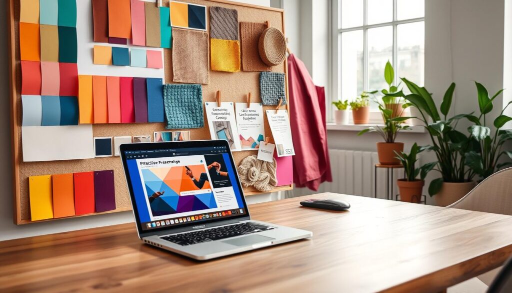
Strip the board down to its core. What’s left should be clear and strong. This is your foundation. It’s focused and tells a story.
Now, add something unexpected. This is your surprise element. It could be a bold color, a rough texture, or something vintage.
This twist makes your board stand out. It shows you’re in control. Adding this risk is a skill in presentation tips. It proves you didn’t just pick safe options but made a statement.
The best presentation tips often include this one detail. It gives people something to talk about. It turns your board into a conversation starter.
The surprise should add depth, not confuse. It’s like the spice in your dish. This final edit makes your presentation go from good to great.
Getting this balance right is key. It turns a mood board into a powerful visual argument. Your presentation tips will leave a lasting impression.
Translate boards to specs finish schedules cut sheets and SKUs
Your mood board’s beauty is now translated into precise procurement language. The art show is over. Now, we build the museum.
Your beautiful board is worthless if it can’t be built. The “vibe” you curated disappears when a contractor asks about paint sheen. Or when a vendor needs the model number for a light fixture. Translation is the unglamorous, critical bridge between inspiration and invoice.
Think of it as writing the recipe after you’ve styled the photo of the perfect meal. Without exact measurements and ingredients, no one can recreate the dish. Your job shifts from visionary curator to meticulous project manager.
You need three key documents. The finish schedule is your master list of every surface treatment. It specifies paint colors, sheens, tile grout colors, and wood stain finishes. No more “kind of a warm white.” It’s now “Benjamin Moore White Dove, OC-17, Eggshell.”
Then come the cut sheets and SKUs. A cut sheet is the technical data sheet for a specific product, like a light fixture or faucet. The SKU (Stock Keeping Unit) is its unique commercial identifier. This is how you ensure the fabric on the digital sofa is the exact one that arrives at the warehouse.
This is where digital tools stop being a luxury and start being your structural engineer. They build the bridge. Specialized apps turn visual curation into actionable data, automating the grunt work.
Take an app like Morpholio Board. Its genius is in integration. You can drag and drop real products from curated libraries directly into your layout. The magic? It automatically generates specification data behind the image. That marble tile you placed isn’t just a pretty picture; it’s now linked to its supplier, collection name, and price.
Other digital tools, like Adobe InDesign, offer brute-force precision for complex finish schedules. They create what I call “implementation matrices”—documents that explicitly connect an inspirational image to its corresponding paint code, fabric SKU, and fixture cut sheet. It’s the ultimate cheat sheet for your builder.
The automation these digital tools provide is a massive error-reducer. It eliminates the tedious, mistake-prone process of manually typing codes from a catalog into a spreadsheet. The spec sheet becomes a living, connected document.
| Document | Its Purpose (The “Why”) | Key Data Points (The “What”) |
|---|---|---|
| Finish Schedule | Defines every surface material and finish in the space. It’s the law for painters, tilers, and carpenters. | Room name, surface (e.g., “Ceiling”), manufacturer, product name/color, sheen/finish, application notes. |
| Cut Sheet | Provides the technical blueprint for a specific manufactured item. Essential for ordering and installation. | Manufacturer, model number, dimensions, materials, electrical specs, installation diagram, compliance codes. |
| SKU List | The shopping list. It tells the procurement team or client exactly what to buy and from where. | Item description, manufacturer SKU, quantity, unit price, vendor/supplier name, lead time. |
Mastering this translation is the final, quiet power move. It transforms you from someone with good taste into someone who executes good taste. The right digital tools don’t just make it easier; they make it bulletproof.
Presenting to stakeholders clarity sequence and alternative options
Presenting a mood board is not about a big reveal. It’s more like a guided tour through a story you’ve built. You’re not showing a famous painting and waiting for applause. Instead, you’re taking a group on a tour of a future space, where every visual supports your argument.
The aim is not just a nod of approval. It’s about starting a lively discussion. View the board as a starting point for dialogue, not a finished mandate. This change in thinking is your most valuable presentation tip. It turns you from a dictator to a curator of options.
Plan this tour with precision. Follow a four-act structure:
- Context Setting: Start by reminding everyone why you’re here. Recap your three key mood words. Refresh their memory of the goal you’re all working towards.
- Board Presentation: Lead the tour with a clear sequence. Start with color, then materials, texture, and end with a surprise.
- Facilitated Discussion: Ask questions to spark conversation. “How does this texture work here?” This is where the real talk happens.
- Next Steps Confirmation: Make sure decisions are made and actions are assigned. What gets chosen? What gets priced?
Now, for the clever move: always have a backup plan ready. Show your main choice, then a cheaper alternative with a similar feel. This isn’t hesitation; it’s smart planning. You’re showing you can solve problems before they arise.
What’s the alternative? Not having one. That invites unwanted questions from stakeholders who remember a budget meeting. By showing a smart swap, you show flexibility and teamwork. You make them feel part of the solution, not just following your lead.
This approach—clear sequence and open alternatives—is what makes you a trusted guide, not just a vendor. It’s the difference between giving a map and walking with your client, showing them the way and the sights. That’s how you turn a presentation into a partnership.
Common pitfalls copying trends ignoring context over busy mixes
This section is your guide to fixing common problems in concept boards. A great board doesn’t protect you from design issues. Let’s look at the usual problems.
The first issue is derivative design. It happens when you rely too much on popular images. Your project is unique, with its own special features. Trends are just ideas, not rules. For example, a marble countertop might not work for a family that loves red wine.
The next problem is ignoring context. Beautiful boards often don’t work in real life. That light-wood floor might not be good with big dogs. A dark paint color could make a room too dark.
Lastly, there’s the visual cacophony of too many things. Every element is competing for attention. This makes the board hard to look at and can lead to too many changes. A good board is simple and focused.
Don’t let pretty pictures distract you from practical thinking. A successful board is a selection, not just a collection. To avoid these mistakes, start with our free mood board templates. They help you organize your ideas.
Archiving and versioning for smooth procurement and installs
Just because the client says yes, doesn’t mean the work is done. The real work starts now. Your mood board is more than just pretty pictures. It’s a detailed plan, a legal guide.
Write down every choice you make. Keep track of changes and why they were made. This careful planning stops you from going back to square one. Version control is your safety net.
Save everything. Keep the final digital file safe. Take clear photos of the physical board. Store all emails and meeting notes. This isn’t just keeping things. It’s protecting your vision.
Use clear names for your files. For example, “Riverhouse_Kitchen_MoodBoard_vFINAL_20241105”. If there’s a mix-up, you can quickly fix it. This archive keeps your project on track.
This careful step turns a creative idea into a reliable process. It makes sure your vision stays true as it moves into reality.