The optical processing of color dictates human emotion within a built environment. Selecting a paint finish represents a highly structural decision. The walls act as the primary boundaries of the residential space. They reflect light directly into the eyes of the occupants. A poorly chosen pigment causes visual fatigue and biological stress. A scientifically sound palette promotes deep recovery. The home interior colour dictates the entire atmospheric baseline of the floor plan.
The Biological Response To Pigment And Light
Human biology reacts instantly to varying light frequencies. The optic nerve transmits visual data directly to the hypothalamus. This interaction influences heart rate, cortisol production, and sleep cycles. High-chroma reds act as physical stimulants. Desaturated blues trigger the parasympathetic nervous system. This biological shift lowers blood pressure and slows respiration. Reviewing the principles of color theory helps map exactly how specific wavelengths alter human behavior inside an enclosed room. This biological reality proves that paint serves a physiological function. It moves far beyond superficial decoration.
Measuring Light Reflectance Value In Residential Architecture
Paint manufacturers assign a Light Reflectance Value (LRV) to every formula. This metric measures the exact percentage of visible light a surface bounces back into the room. Pure black registers at zero, absorbing all light. Pure white registers near one hundred. A room featuring limited natural daylight demands high-LRV paint. This application prevents the space from feeling like a dark cavern. Applying a low-LRV shade to a small, windowless powder room creates a moody, intimate jewel-box effect. The physical dimensions of the room dictate the required LRV threshold.
| Paint LRV Range | Light Reflection | Best Architectural Application |
| 80 – 100 | Very High | Dark hallways, low-ceiling basements |
| 50 – 79 | Medium | Primary living spaces, south-facing rooms |
| 20 – 49 | Low | Bedrooms, formal dining spaces |
| 0 – 19 | Very Low | Media rooms, intimate powder baths |
Warm Tones And Social Connectivity
Warm colors pull the walls visually forward. Think of deep terracottas, muted ochres, and rich burgundies. The architecture feels closer and more protective under these hues. Earth-based pigments stimulate conversation. They encourage inhabitants to linger. Dining rooms and central living lounges benefit heavily from warm-toned palettes. A deep clay wall absorbs shadows. It creates a cozy, enveloping environment during evening hours. The selection of warm pigments requires careful editing. Too much saturation makes the space feel visually heavy or stifling.
Cool Palettes For Recovery And Focus
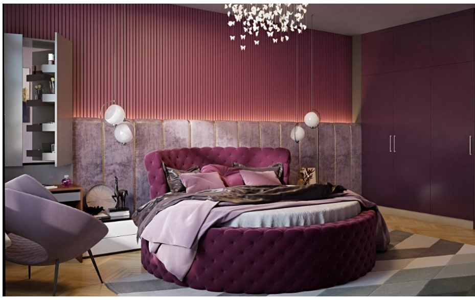
Cool tones push the physical boundaries of the room outward. Sage green, dusty blue, and pale lavender make the walls seem to recede. These desaturated colors provide extreme visual relief. They stand as the standard choice for bedrooms and recovery zones. A cool-toned environment mimics the natural colors of the sky and the forest canopy. The brain registers this data as a signal for rest. High-stress areas of the home operate best under these calming color frequencies. Private offices and primary bathrooms find profound balance with cool, desaturated paints.
The Influence Of Artificial Lighting On Colour Perception
The appearance of any paint shifts dramatically based on the dominant light source. Natural daylight changes temperature constantly. A soft gray looks fresh and crisp at sunrise. That exact same gray appears flat and muddy by sunset. Artificial lighting controls the visual narrative after dark. Standard LED bulbs emitting light above 4000 Kelvin cast a harsh, bluish glare. This cold light destroys complex paint undertones. Selecting bulbs between 2700 and 3000 Kelvin casts a warm, amber glow. This lighting strategy supports the natural circadian rhythm. It adds deep, rich character to the painted drywall.
The Psychological Mechanics Of Neutral Tones
Neutral palettes dominate mass-market residential construction. Builder-grade beige and stark white offer a blank canvas. These tones carry zero emotional risk. A home lacking any saturated color risks feeling sterile and clinical. The human brain requires visual stimulation to feel grounded. A completely white room mimics sensory deprivation. Introducing complex neutrals solves this biological deficit. Mushroom grays, warm taupes, and soft greiges contain multiple underlying pigments. These complex formulas react dynamically to shifting sunlight. They provide a calm, unobtrusive background. They offer enough visual friction to keep the eye actively engaged.
Material Finishes And Textural Friction
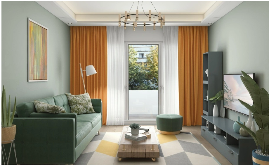
The chemical finish of the paint alters the color perception completely. Manufacturers offer finishes ranging from flat matte to high-gloss lacquer. A flat finish absorbs light. It hides drywall imperfections and creates a soft, suede-like texture. A high-gloss finish acts as a colored mirror. It bounces light aggressively across the room. Painting a dining room ceiling with high-gloss lacquer reflects the table candelabras. This creates a surreal, infinite spatial effect. Mixing paint finishes introduces structural tension. Applying an eggshell finish to the drywall and a high-gloss finish to the wooden trim creates distinct architectural separation. The color remains identical. The sheen dictates the boundary.
Applying Monolithic Strategies For Visual Calm
Traditional painting methods force a high contrast between the wall color and the baseboards. This visual break splits the architecture into separate geometric blocks. Monolithic color drenching provides a sophisticated alternative. Applying the exact same color to the walls, trim, doors, and ceiling erases the hard boundary lines of the room. The corners blur into deep shadow. The space feels unified and infinite. Those planning extensive renovations often partner with experts in custom home building to guarantee the millwork and drywall finishes support this seamless, single-color application. Precision in carpentry supports the monolithic paint layer perfectly.
Correcting Spatial Flaws With Strategic Paint Application
Paint operates as a corrective architectural tool. A room with an uncomfortably low ceiling feels compressive and heavy. Painting that ceiling a bright, highly reflective white draws the eye upward. This trick fakes the illusion of extra vertical volume. A long, narrow corridor often resembles a tunnel. Painting the far end wall a dark, heavy color pulls that surface visually forward. This color application squares off the proportions of the hallway. The precise application of color solves structural imbalances without requiring the demolition of existing walls.