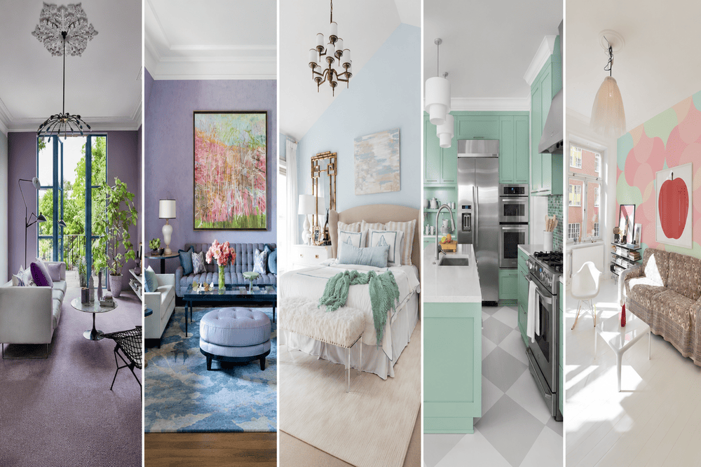
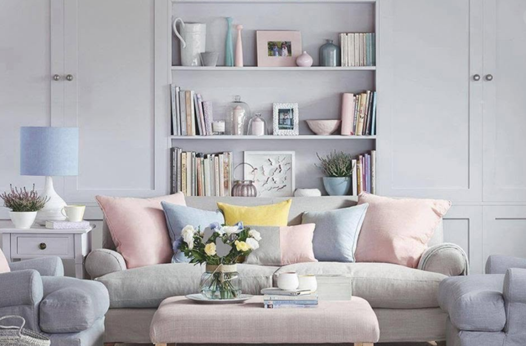
Interior architecture is experiencing a definitive shift away from stark, clinical white spaces and heavily saturated, high-contrast environments. Designers and homeowners alike recognize the visual fatigue caused by intense color palettes and sterile minimalist boxes. The current trajectory favors environments that offer visual rest. This shift brings the pastel and muted shades interior to the forefront of modern residential design.
Applying these soft colors effectively requires far more than picking a light color from a paint deck. The modern interpretation of pastels rejects the overly sweet, saccharine hues associated with mid-century nurseries or 1980s pop design. Today’s application relies on complex, muddy tones. These colors are heavily desaturated, acting as complex neutrals that shift and change depending on the time of day, the lighting conditions, and the surrounding architectural materials. Building a sophisticated, soft environment demands a strict comprehension of color chemistry, lighting design, and textural balance.
The Chemistry Of Color: Tints, Tones, And Shades
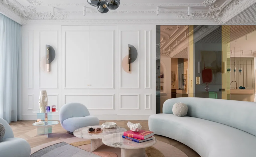
A firm grasp of color theory separates a successful muted interior from one that feels flat or amateurish. Pure colors, known as hues, sit on the outer edge of the color wheel. They operate at maximum intensity and saturation. To reduce this intensity and make a color appropriate for large-scale interior applications, designers alter the hue using three distinct methods: adding white, adding black, or adding gray.
Adding white to a pure hue creates a tint. Traditional pastels—like baby blue, pale pink, and mint green—are tints. They are light, airy, and highly reflective, but they can easily read as juvenile if applied without architectural restraint. Adding black to a pure hue creates a shade, darkening the color and giving it a heavy, imposing quality, such as navy blue or forest green.
The modern muted palette relies entirely on tones. A tone is created by adding varying levels of gray to a pure hue. This process of desaturation reduces the vibrancy of the color without necessarily making it significantly lighter or darker. Adding gray complexifies the color. A pure yellow becomes a sophisticated, earthy ochre. A bright red becomes a soft, faded terracotta. A vibrant green transforms into a muted sage or olive. These gray-based tones offer profound depth. They absorb shadows beautifully and provide a calming background that does not demand immediate visual attention.
Light Reflectance Value And Spatial Perception
Paint manufacturers assign a Light Reflectance Value (LRV) to every color they produce. This number, measured on a scale from 0 to 100, indicates exactly how much visible light a color will reflect back into a room. An absolute, pure black absorbs all light and has an LRV of 0. A pure, brilliant white reflects all light and has an LRV of 100.
Most stark white paints used in modern minimalist homes sit between 85 and 95 on the LRV scale. These high-reflectance paints bounce light aggressively, creating bright, highly energized environments that can feel visually exhausting over long periods. Muted shades and complex pastels typically fall into the 40 to 70 LRV range. This mid-range reflection provides enough bounce to keep a room from feeling cavernous or dark, but it absorbs enough light to eliminate glare and create a soft, diffused atmosphere.
Understanding this metric helps architects manipulate the perceived size and shape of a room. Painting the walls and ceiling of a small, windowless powder room in a muted, low-LRV dusty plum creates a deeply intimate, jewel-box effect. Applying a higher-LRV soft greige to the walls of an expansive, south-facing living room prevents the intense afternoon sun from blinding the occupants, absorbing the harsh rays and turning them into a warm ambient glow.
The Psychological Mechanics Of Low-Chroma Environments
Human biology reacts instantly to color. The optic nerve transmits data regarding light frequencies directly to the hypothalamus, the part of the brain responsible for regulating hormones, body temperature, and sleep cycles. Highly saturated, high-chroma colors like primary red and bright orange act as biological stimulants. They raise the heart rate, increase blood pressure, and trigger a mild adrenaline response. These colors perform well in high-energy commercial environments or fast-food restaurants where rapid turnover is the goal, but they actively work against the biological need for recovery within a residential setting.
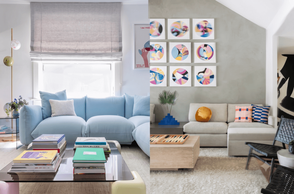
Low-chroma colors—specifically muted greens, soft blues, and earthy pinks—trigger the parasympathetic nervous system. This biological network manages rest and digestion. Surrounding the human eye with desaturated colors actively lowers cortisol levels and slows the resting heart rate. The home functions primarily as a sanctuary, a barrier against the intense stimulation of the outside world. Designing a pastel and muted shades interior is a biological strategy aimed directly at stress reduction and mental clarity.
Specific muted hues carry specific psychological associations. Muted greens connect the interior space directly to the natural world, promoting feelings of renewal and balance. Desaturated blues mimic the sky and water, offering profound tranquility and lowering anxiety. Faded, earthy pinks and terracottas provide physical warmth and comfort without the aggression of a pure red. Reviewing the fundamental principles of color theory helps designers map these specific psychological responses to the intended function of each individual room.
Analyzing Directional Light And Color Shifts
The appearance of a muted color never remains static. It shifts dramatically based on the geographic orientation of the room’s windows and the time of day. A dusty rose that looks incredibly warm and inviting in a south-facing room might read as a muddy, cold gray in a north-facing room.
North-facing rooms receive indirect, cool, bluish light throughout the day. This light strips away warmth. If you apply a cool-toned muted color, like an icy blue or a pale lavender, to a north-facing room, the space will feel distinctly chilly and uninviting. Designers counteract this by using warm-based muted shades in northern rooms—think soft peaches, yellow-based creams, and warm mushroom grays. The warm pigment fights against the cool light, achieving a balanced neutral appearance.
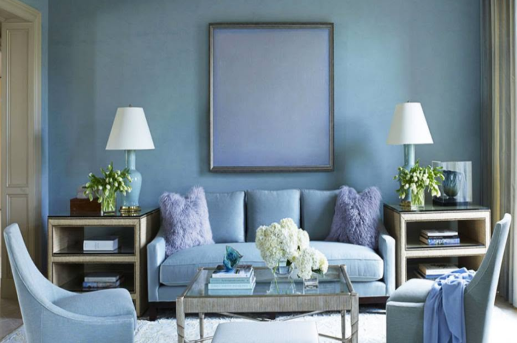
South-facing rooms receive intense, warm, golden sunlight all day long. This light magnifies warm colors. A soft yellow pastel in a southern room will amplify into a bright, aggressive gold by the afternoon. To balance this intensity, south-facing rooms handle cool, muted shades perfectly. Desaturated sage greens, dusty blues, and cool-toned greiges absorb the warm light beautifully, keeping the room feeling fresh and temperature-balanced.
East-facing rooms get bright, warm morning light that quickly turns into cool, shadowy indirect light by the afternoon. West-facing rooms experience the opposite, starting cool and ending with intense, fiery sunset light. Colors in these rooms must be highly adaptable. Complex, muddy tones that straddle the line between warm and cool—like a greige with a slight green undertone—perform best in eastern and western exposures, looking equally sophisticated in both morning shadows and evening sun.
| Room Exposure | Quality of Natural Light | Recommended Muted Shades | Colors to Avoid |
|---|---|---|---|
| North | Cool, bluish, indirect, flat | Warm mushroom, dusty peach, pale ochre | Icy blue, cool gray, stark white |
| South | Warm, golden, direct, intense | Sage green, dusty blue, cool greige | Bright yellow, intense terracotta |
| East | Warm morning, cool afternoon | Soft clay, pale blue-green, warm white | Highly saturated reds or oranges |
| West | Cool morning, fiery afternoon | Desaturated olive, soft taupe, muted navy | Heavy, dark browns or intense golds |
Artificial Lighting Strategies For Desaturated Palettes
When the sun sets, the artificial lighting system takes complete control of the color palette. Standard residential lighting often destroys the complexity of muted shades. Using the wrong light bulb turns a sophisticated tone into a flat, lifeless surface.
The Color Rendering Index (CRI) measures how accurately a light source reveals the true colors of an object compared to natural sunlight. The scale goes up to 100. Cheap LED bulbs often have a CRI of 80 or lower. Under these lights, muted greens turn sickly, and soft pinks look gray. For a pastel and muted shades interior, bulbs with a CRI of 90 or higher are absolutely non-negotiable. High-CRI lighting guarantees the subtle gray undertones of the paint remain visible and accurate after dark.
Color temperature, measured in Kelvin (K), dictates the warmth or coolness of the light itself.
- 2700K (Warm White): This temperature mimics traditional incandescent bulbs. It casts a heavy yellow glow. It enhances warm muted shades like peach and clay but can make soft blues and cool grays look muddy and yellowish.
- 3000K (Soft White): This acts as the standard for modern high-end interiors. It provides a clean, neutral white light with just a hint of warmth. It accurately renders both cool and warm muted tones, making it the safest choice for a mixed palette.
- 4000K+ (Cool White/Daylight): These bulbs cast a harsh, bluish light. They belong in commercial garages or operating rooms, never in a residential living space. They will instantly wash out any muted shade and create a sterile, clinical environment.
Textural Interventions: Preventing Visual Flatness
The greatest risk when designing a muted interior is creating a space that feels visually flat and uninteresting. Without the high contrast of bold colors or the crispness of black and white, the eye needs another reason to engage with the room. Texture solves this problem. When color steps back, material texture must step forward.
Applying a flat latex paint to smooth drywall does nothing to enhance a muted shade. Designers prefer applying soft colors through heavily textured architectural finishes. Limewash and Roman clay treatments are highly favored. These finishes apply muted colors with a trowel or a wide brush, leaving a mottled, suede-like texture on the wall. The subtle variations in the plaster catch the light differently, creating deep shadows and bright highlights within the exact same color plane. The wall stops being a flat boundary and becomes a dynamic, shifting surface.
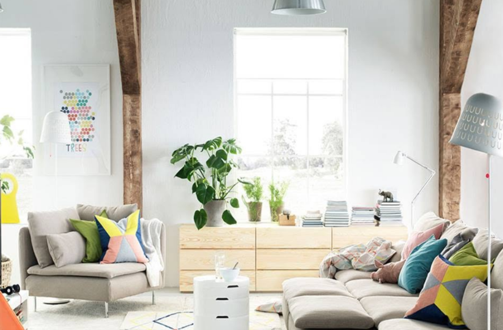
Furniture choices follow the same rule. A muted sofa upholstered in a flat, tightly woven synthetic fabric looks entirely unappealing. That same muted color applied to a heavy linen, a thick wool boucle, or a distressed velvet becomes incredibly rich and inviting. The pile of the fabric creates micro-shadows that add depth to the low-chroma color.
Material Pairings That Elevate Soft Colors
The hard materials integrated into the architecture act as the grounding force for a pastel interior. Soft colors require heavy, authentic materials to prevent the space from feeling insubstantial or overly delicate.
Raw, matte-finished woods provide excellent contrast. Flooring and cabinetry made from white oak, walnut, or heavily grained ash add organic warmth and a sense of permanence. High-gloss, heavily stained woods clash with the chalky, matte nature of muted walls. The goal is to keep all surfaces feeling tactile and close to their natural state.
Stone selection dictates the luxury level of the space. Carrara marble, with its stark white background and heavy gray veining, can sometimes feel too aggressive against a soft, dusty pink wall. Instead, designers turn to stones with warmer, more muted backgrounds. Honed Taj Mahal quartzite, unfilled Travertine, or soft green soapstone pair flawlessly with desaturated palettes. The honed (matte) finish on the stone absorbs light in the exact same manner as the muted wall colors, creating a cohesive, unbroken visual field.
Metals provide the necessary visual punctuation in a low-contrast room. Chrome and highly polished nickel act like mirrors, bouncing light sharply. Unlacquered brass, aged bronze, and blackened steel offer a much better pairing. These metals feature a dull, living patina that absorbs light and adds a layer of historic weight and industrial friction against the softness of the pastel shades.

Executing The Muted Kitchen Architecture
The kitchen remains the most expensive and structurally complex room in any residential build. For the last fifteen years, the market demanded stark white shaker cabinets, white subway tile, and white quartz countertops. This monochromatic formula felt clean but entirely lacked personality. The shift toward muted shades brings warmth and deep character back to the culinary space.
Cabinetry provides massive planes of color. Soft mushroom, desaturated olive green, and pale grayish-blue are replacing stark white as the default choices for custom cabinetry. Because these colors are heavily grayed out, they act as neutrals, allowing homeowners to introduce color without committing to a bright, overwhelming hue.
Executing this correctly requires planning the entire material board at once. If the lower cabinets feature a muted sage green, the countertops might feature a honed Danby marble with soft green and brown veining to tie the palette together. The backsplash might consist of handmade, unglazed Zellige tiles in a soft off-white. The uneven surface of the handmade tile provides the necessary texture, breaking up the flat planes of the cabinetry.
Hardware and plumbing fixtures in the muted kitchen should lean toward matte or patinated finishes. A brushed brass faucet stands out beautifully against a soft gray-blue cabinet, whereas a polished chrome fixture would feel jarring and out of place. The appliances themselves are frequently hidden behind custom cabinet panels to maintain the unbroken flow of the muted color scheme, preventing large blocks of stainless steel from interrupting the soft visual aesthetic.
Designing Restorative Bathrooms
Bathrooms are inherently hard, cold spaces. They are filled with porcelain, glass, mirrors, and tile. Introducing muted shades and pastels into the bathroom counteracts this structural coldness, turning a sterile utility room into a spa-like recovery space.
Color reflection plays a massive role in bathroom design. The color on the walls reflects directly onto the skin of the person standing in front of the mirror. Green and yellow walls cast sickly, unflattering shadows on human skin. Warm, muted shades—like dusty rose, pale peach, or soft terracotta—cast a warm, flattering glow. These colors are frequently applied to the ceiling and walls, creating a soft, enveloping atmosphere that mimics the warm light of early morning.
Tile selection moves away from high-gloss ceramics. Matte porcelain, tumbled limestone, or soft, honed terrazzo provide slip resistance and visual softness. A bathroom featuring walls painted in a muted clay tone, floors clad in tumbled Travertine, and fixtures finished in aged bronze feels ancient, grounded, and incredibly relaxing. It completely abandons the clinical, hospital-like aesthetic of the standard modern bathroom.
Architectural Flow And Custom Integration
Applying a muted palette across an entire home requires strict architectural coordination. You cannot treat each room as an isolated box. The colors must flow logically from one space to the next, creating a unified narrative. This level of cohesion is best achieved during the planning phases of a new build. Partnering with professionals in custom home building allows homeowners to map out sightlines and dictate how color transitions through open doorways and down long corridors.
A successful layout relies on a tonal gradient. The main living areas, which receive the most natural light and handle the most daily traffic, might feature the lightest, most neutral muted shades—perhaps a soft greige or a warm off-white. As you move into more private, enclosed spaces like dining rooms, studies, or bedrooms, the chroma and depth of the colors increase. The study might feature fully paneled walls painted in a deep, muted forest green, while the primary bedroom relies on a soft, immersive lavender-gray.
The transition between these spaces is critical. The colors must share the same underlying gray or brown undertones so they do not clash when viewed simultaneously. A person standing in the light greige hallway looking into the muted green study should experience a logical, harmonious shift in color, not a jarring shock to the visual system.

Balancing Warm And Cool Tones Within A Single Space
A room painted entirely in cool muted tones—dusty blue walls, a gray sofa, and a cool silver rug—will feel icy and unapproachable. A room heavily dominated by warm tones—peach walls, a terracotta rug, and brown furniture—will feel heavy, muddy, and visually stifling. The most successful interiors rely on a strict tension between warm and cool elements.
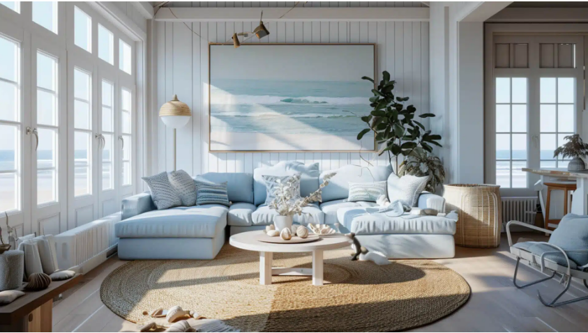
If the architectural shell (walls, ceiling, and trim) features a cool, muted color like a pale seafoam green, the furnishings and hard materials must introduce warmth. Adding a heavily grained walnut dining table, an aged brass chandelier, and a rug with soft rust and ochre tones instantly balances the temperature of the room. The cool walls push back, making the room feel expansive, while the warm furniture pulls the occupants in, providing comfort and grounding.
Conversely, if the walls feature a warm, muted mushroom tone, introducing a cool dusty blue velvet chair or a piece of art with stark, cool gray tones prevents the room from feeling monolithic. This push and pull between the two sides of the color wheel keeps the eye active and the brain engaged, ensuring the low-contrast environment remains dynamic and sophisticated.
The pastel and muted shades interior does not rely on loud statements or aggressive design interventions. It requires a highly disciplined approach to color chemistry, an obsession with tactile materials, and a deep respect for how light interacts with physical surfaces. When executed correctly, these soft palettes create residential architecture that feels timeless, profoundly calming, and entirely removed from the exhausting visual noise of the outside world.